Learn / Guides / Data analysis for marketers
How to build a marketing data analysis report (template and examples)
Creating a data analysis report is an underrated yet critical skill for marketers. A marketing report can impact team, stakeholder, and company decisions, so highlighting (and omitting) the right information is crucial.
But how do you consistently churn out clear and compelling reports? This guide will help you tie your reports up in a neat little bow, ensuring alignment with and buy-in from your audience—and beneficial decisions for your end-users.

Data analysis reporting is a process that combines quantitative and qualitative data to evaluate performance, share findings, and inform future decisions. One common example is reporting on the results of a marketing campaign, but there are plenty more reasons marketers might create a data analysis report.
More examples—plus the reporting steps, tools, and template—await below, so keep reading.
Summary
Get started fast with our free monthly data analysis report template, and follow these six key steps to creating a persuasive report:
Nail down the elements: provide a title, timeframe, and summary. Present data visually and close with action points.
Determine your purpose: figure out why you're making this report so you can focus on the right information
Identify your audience and their needs: define your readers and tailor your report to their requirements
Put your key insights first: maximize Hotjar, a multi-product data analytics platform, to track metrics and gather meaningful insights
Visualize your data: incorporate charts, heatmaps, and other visuals to convey facts and insights effectively
Ask your audience for feedback: collect your audience's feedback to continuously improve your reporting approach
How to write a data analysis report in 6 easy steps
Knowing how to write a data analysis report is vital—especially in a data-informed field like marketing. Organizing and visualizing your data helps you
Evaluate strategies and performance
Inform future decisions and actions
Share findings and recommendations to serve users better
However, even marketers dealing with data regularly may find the task time-consuming. But we can promise you one thing: it won’t feel that way once you have a repeatable process and fewer data analysis and visualization tools to work with.
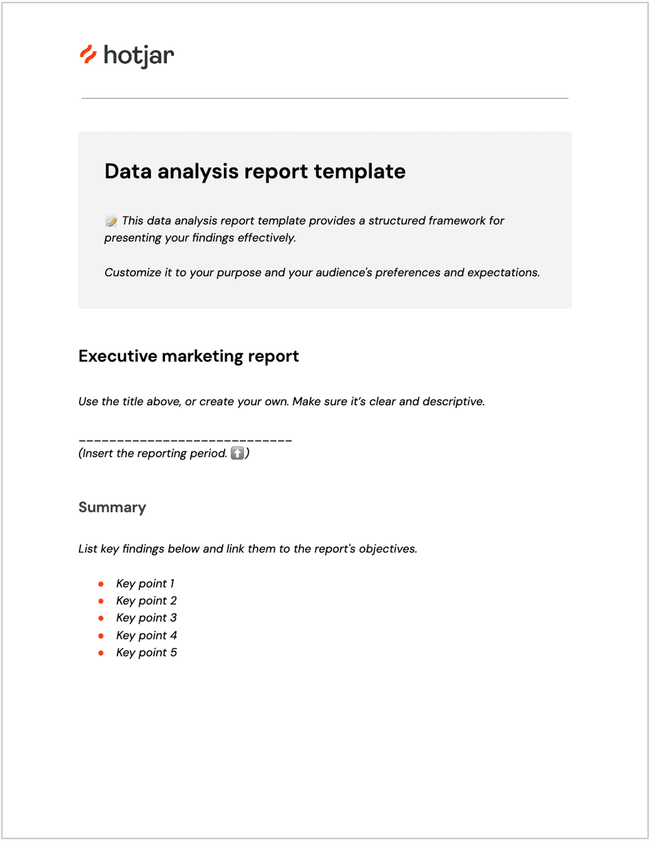
1. Nail down the elements
This chapter of our data analysis guide focuses on creating an executive report. But regardless of the type of report (we'll touch on a few more of them later), most share the same building blocks:
Title: use a straightforward title to convey your report's intent. Call it as it is, whether it's your overall marketing performance or a multi-channel marketing campaign.
Timeframe: reporting intervals include daily, weekly, monthly, quarterly, and annually. Monthly data analysis reports work best for marketing teams, clients, and executives.
TL;DR: summarize your key objectives and findings, such as insights, issues, and recommendations, in an executive summary. This sets your audience's expectations and helps busy team members focus on what matters to them.
Body: your bar charts, graphs, tables, and heatmaps go here. Add visual evidence from your analysis that supports your conclusion to win buy-in from decision-makers.
Conclusion: backed by the data in the body, state your plan for making progress with your goals. For instance, say you need additional dollars to spend on social media advertising since it's shown a consistent return on investment (ROI).
Discover actionable data, enhance business decisions
Craft compelling marketing reports fast. Collect, analyze, and report on crucial insights using Hotjar’s multi-product platform to get stakeholder buy-in and team alignment.

2. Determine your purpose
What data should you incorporate in your report? The answer lies in the purpose of your data analysis report.
Consider this: what do you hope to achieve when you share the results of your analysis? Is it to show stakeholders how customers use your products so you can improve them? Or is it to enlighten your team about what customers like so you can tailor campaigns to each segment?
Pulling the relevant data becomes a breeze once you’ve locked in your report’s primary purpose.
Collect meaningful data in real time with Hotjar
Marketers conduct quantitative data analysis to answer questions like, “How many?” or “How often?” In other words: this type of analysis involves numerical data, such as traffic and conversions.
But numbers alone don't provide the whole picture—you need to uncover the why behind them. Why did traffic from France increase yesterday? Why do certain customers rage-click on a call-to-action (CTA) button on your Demo page?
It's qualitative data that reveals the reasons customers behave a certain way. This non-numerical data includes behavioral observations, interview clips, and survey responses.
In Hotjar, an analytics platform for user behavior and digital experience insights, you can gather qualitative data via Surveys, Feedback, and Interviews, plus visualize quantitative data via Heatmaps and capture user behavior in real-time with Recordings, all from a single platform.
Here, it's easier than ever to collect and analyze quantitative and qualitative data, and build a user-centric marketing report based on your analysis.
Complement quantitative data with qualitative insights
3. Identify your audience
Always determine two audience types for your report: primary and secondary.
Company executives, clients (for marketing agencies), team members, and cross-functional collaborators, such as product managers, can fit into either category, depending on your report. Once you've categorized your primary and secondary audiences, it's easier to customize the report to their needs. Here are a few tips on how to do it:
Speak their language: in any business setting, this means striking a balance between not too formal and not too casual—think business in the front, party in the back
Discuss results, not methodologies: immediately dive into the insights gleaned from your quantitative and qualitative data analysis
Present key takeaways in the summary: as we said earlier, highlight your main points at the top of your report so the reader can instantly note what they think is interesting
Place eye-catching visuals in the body: your audience may skim through and search only for additional details in the body, so ensure your data visualization is easy to interpret
📋 Need a hand? Try using a template
If you’re unsure how to design your report or prefer not to build from scratch each time you run it, use a data analysis report template. Ensure it’s a well-crafted one aimed at showing—instead of telling—your audience what works and what doesn’t.
Aside from making you look good (😎), an excellent template saves you time, and gives your readers something to rely on during each reporting period.
So, what would an extremely occupied marketer do? Streamline the creation process, of course! Plug, play, and present your insights with our free monthly data analysis report template to get started 📈.
Click the link above to make a copy of our handy template
4. Prioritize key insights
Here comes the exciting part: assembling the data to draw a clear picture for your audience. Before you discovered this guide, you might have gathered data manually from various sources, such as Google Analytics, your preferred A/B testing platform, and even Hotjar.
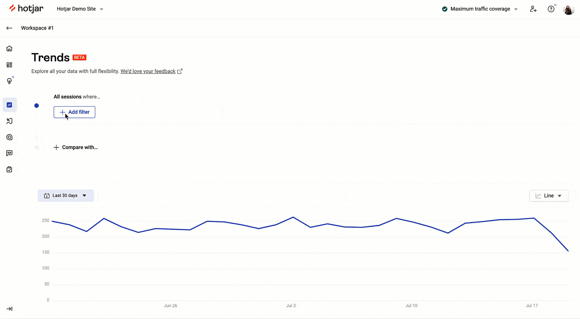
Luckily for you, there's a faster way to track and spot patterns occurring in your custom metrics. Hotjar Trends enables you to find the behavioral data you need, such as visitors who viewed any of the two landing page variations you were A/B testing, or users who rage clicked (a sign of frustration) before exiting your checkout page.
Compare your A/B test participants or new and returning users to see if one segment encountered any issues. Or view your rage clicks over time to understand what makes users frustrated. Then, click the ‘play’ icon to dive straight into your session recordings and discover the reason behind their actions.
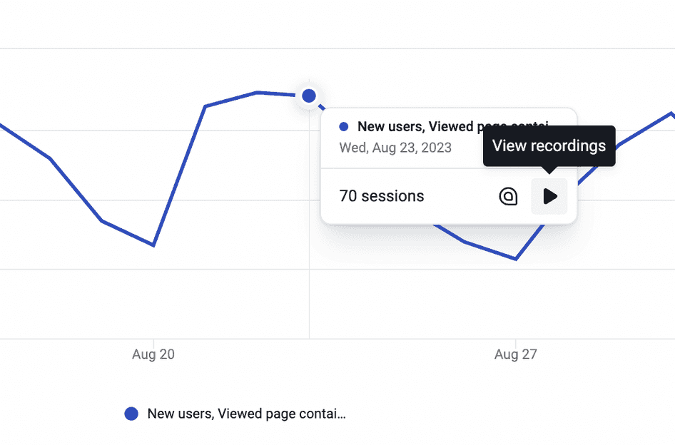
Go from quantitative to qualitative data in a single click with Hotjar Trends
Finally, screencap the charts in Trends and link to some relevant recordings in your trend report.
A sample trend report showing rage clicks over time, created via Hotjar Trends
What else can you do within Hotjar? Use Highlights and Collections to group snippets of recordings and heatmaps to support your conclusion. Add these meaningful insights to your monthly report or share them with teammates on an ordinary day, without having to switch between multiple analytics tools.
Trends, Highlights, Recordings…will my audience remember all these names?
They may even start looking for them in every report from now on. Our tools and features are self-explanatory, so everyone, from the marketing and sales teams to clients and C-suite execs, can quickly understand them.
Personally I love using Highlights and Collections together. I see each highlight as a self-contained explanation for the case I’m making to the product team. I’ve got the video. I’ve got the tags if I need them. I’ll add comments and a thread for a response.
There’s no risk of distraction and minimal lift to get my stakeholders directly to the central issue.
And then the Collections view basically creates a visual report of all the evidence I have for a given case. Here's how much this hurts (one Highlight); click on the rest of these if you can stomach it (a Collection of Highlights).
5. Incorporate visual data
Whether you're comparing past and present conversion rates or sharing multiple data sets, it's crucial to get your point across quickly. After all, you're not the only team or department vying for your audience's attention. This is where data visualization plays a considerable role: maps and charts allow you to effectively convey your message by making your data interactive, digestible, and enjoyable.
To visualize data, use your spreadsheet of choice (for example, Excel or Google Sheets) or a dedicated platform like Tableau. You can also screenshot your data in the Hotjar Dashboard to save time and effort. Showcase relevant heatmaps, recordings, survey responses, interview snapshots, and direct feedback to drive your point home and get everyone on the same page.
6. Collect feedback from your audience
Just as Surveys and Feedback let you connect with actual customers, they also prove valuable in asking your audience’s thoughts once you’ve sent out your reports. By building a custom survey—for free—in Hotjar, you can include and analyze open-ended questions like, “How did this data analysis report help you?” and “What would you want to see in the next report?”
This enables stakeholders to give you proper feedback, especially if they didn't get the chance to speak after your presentation.
4 examples of data analysis reports
Now, we’re tackling four popular types of data analysis reports. Practice makes permanent, so let’s go over the ones you’ll likely produce regularly (you'll ace them in no time).
Executive report or digital marketing report
This comprehensive report combines vital insights into your marketing efforts across various channels. It tracks metrics like advertising cost, conversion rate, customer acquisition cost, and online revenue.
Remember: you'll send this document out to company executives who want to see how marketing directly contributes to the bottom line. Be sure to connect your efforts to revenue. And what better way to demonstrate your impact than showing heatmaps or recordings of people responding positively to your campaigns?
Search engine optimization (SEO) report
While an executive report may contain an SEO performance overview, this specialized report breaks down organic traffic in detail. Show your keyword rankings, conversion rates, and top traffic channels to explain your strategy to executives and stakeholders.
Note that you can track these essential metrics in Hotjar's Dashboard. Screenshot your customized dashboard or share it live with your audience as you discuss key insights. Pull up a recording or two or highlight customer feedback to strengthen your case.
For example, if session recordings reveal an unclear CTA has caused conversions for several landing pages to decline, you might recommend changing the CTA by running an A/B test and going with the winning variation.
Social media marketing report
This data analysis report example unpacks multiple channels. Which ones are helping you spread brand awareness and enhance customer loyalty? As such, you should track social key performance indicators (KPIs) like new followers, total reach, share of voice (SOV), engagement, and website referrals.
You can access relevant data and insights in your social media pages’ in-app analytics or analytics tools like Buffer and Hootsuite.
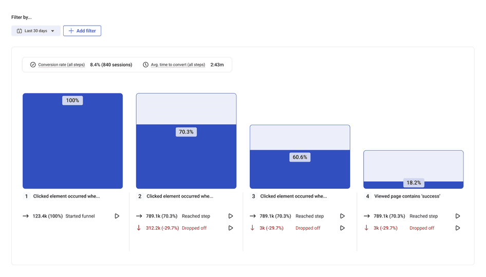
Marketing funnel report
Conversion funnels allow you to home in on the few steps users take from first contact to final conversion. Here’s a basic conversion path if you’re marketing an ecommerce brand:
Homepage > category page > product page > cart > checkout > thank you page
Initially, you’ll look at how many people visit your main pages and who they are. Take your data analysis further with Hotjar Funnels, where you can measure conversion and drop-off rates. Add filters like traffic channels and user attributes to compare performance. To deepen your insights, jump into relevant recordings and see what causes users to leave before they convert.
The best part? You can gradually collect data, conduct funnel analysis, and integrate your findings into your report within Hotjar and without manually handling data: no hassle, no fuss.
Create data analysis reports that drive action
Ensure your team, stakeholders, and executives make data-informed decisions regarding your marketing campaigns and strategies with compelling data analysis reports.
Needle-moving, user-centric insights deserve the spotlight. Start with our free template and populate it with numerical and non-numerical data from Hotjar and other sources. Go ahead and tell a visual story that inspires action today.
Discover actionable data, enhance business decisions
Craft compelling marketing reports fast. Collect, analyze, and report on crucial insights using Hotjar’s multi-product platform to get stakeholder buy-in and team alignment.