Learn / Guides / GA glossary (A-Z)
A complete guide to users in Google Analytics 4
When you pull up the Google Analytics 4 (GA4) homepage, you quickly notice its focus on ‘users’. You see how many people have visited your website over an extended period, how many stopped by in the last 30 minutes, and where they came from.
But these metrics and graphs are only helpful if you understand the term ‘users’ in Google Analytics. (Heads up: it may not mean what you think!)
Summary
Your website or app isn’t really about your company—it’s about providing your users with the information, products, and experience they crave. Google recognizes that and organizes GA4 around users.
What are users in Google Analytics 4? Users are people who access your website or app. GA4 categorizes users into four groups:
But you can’t learn everything about your users from GA4. A product experience insights suite—like Hotjar—provides context into why your users behave the way they do with tools like
What are users in Google Analytics 4?
‘User’ seems like a simple term. You’d expect it to mean someone who uses your website or product—and you wouldn’t be wrong. In Google Analytics 4, users are people who start a session on your website or app.
💡 How Google Analytics 4 identifies users
If a shopper heads to your site on their iPhone, realizes that the user interface (UI) design makes it difficult to add items to their cart, and switches to their MacBook, does GA4 record this as one user or two?
To understand the answer, you have to first understand the three different methods GA4 uses to identify users:
User ID lets you authenticate a user, usually when they sign into their account, and sends this data to GA4. This is the most accurate way to identify a user. (Note: you must manually turn on this option in your website or app tracking.)
Google signals identifies users who logged in to their Google Accounts and opted into Ads Personalization, which uses historical data to show people relevant ads. The Google signals method gives you a solid way to ensure identification across different browsers and devices.
Device ID uses cookies to identify users by their device. This method isn’t as precise, since it doesn’t pick up on the same user visiting from different devices. In other words, if a user switched devices before a transaction, GA4 would register this as two separate users. Still, it’s a solid default option that allows you to identify anonymous website visitors.
You can see how Google Analytics identifies your users by clicking on the hub icon in the bottom left corner, and then choosing ‘Reporting Identity’.
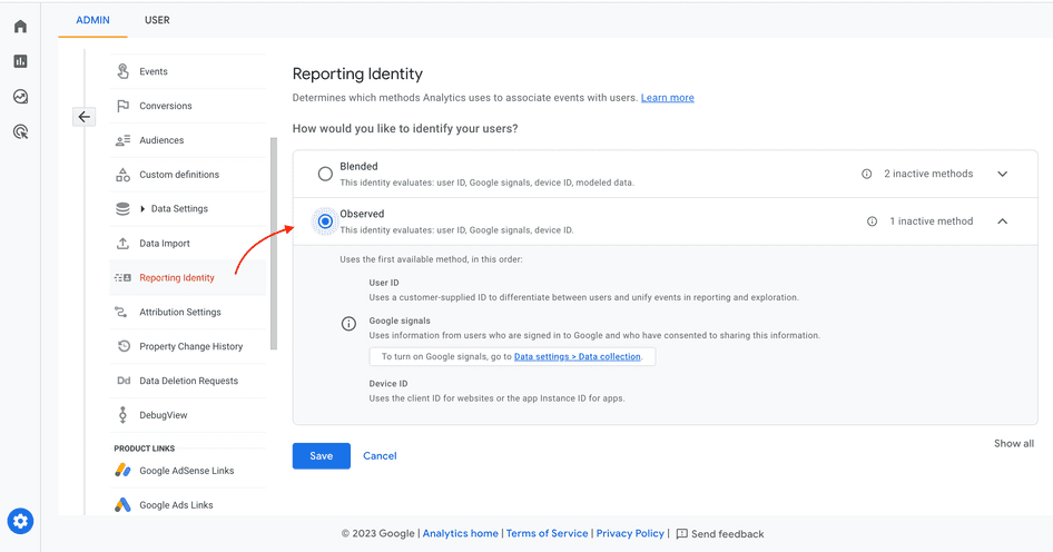
When you select the ‘Observed’ option for reporting identity, Google tries User ID, Google signals, and Device ID (in that order) to identify your website or app’s users
Types of users in GA4
Google Analytics 4 recognizes four different types of users:
Active users
Total users
New users
Returning users
Understanding these helps you make sense of GA4’s rich quantitative data, so you get an accurate picture of who’s coming to your site—and how long they stay, also known as session duration. With this info—and an assist from qualitative data that shows why users behave the way they do—you can create a better UX for visitors to your website or web app.
Understand what users do on your website
Use GA4 to tell you who visits your site—then use Hotjar’s tools to see how they behave (and why) once there.

1. Active users
Google Analytics knows that active users make marketers everywhere do a little happy dance—so they made it their default metric. Any time you simply see ‘users’ listed, interpret this as ‘active users’.
In GA4, active users are either new users or users with engaged sessions. An engaged session is where a visitor stayed on your page for over ten seconds, had more than one pageview, or at least one conversion.
Back in the olden days of Universal Analytics (before its sunset on July 1, 2023), active users had a dedicated report. You can’t access this same report in GA4—since active users takes center stage throughout, it doesn’t need its own spotlight.
But no worries, you can still find out what you want to know by going to ‘Engagement report’.
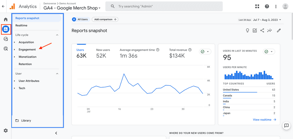
Click Reports > Engagement to access active user metrics
Once you’re in the Engagement reports, you see an overview with user data like
Average engagement time: the time an active user has your site in focus or your app in the foreground
Users in last 30 mins: for real-time user activity, broken down by page
User stickiness: to compare active user engagement in a narrow window with a broader one, i.e. the ratio of daily active users (DAU) to monthly active users (MAU)
User activity over time: to chart the number of active users over the past 30 days, seven days, and one day
Use this data to see how users react to your latest customer-centric marketing campaigns and website changes. For example, when you release a new social media ad campaign, your user activity over seven days might rise, compared to your 30-day performance. (Success!)
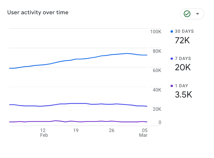
This Engagement report shows how user activity has ebbed and flowed over time
2. Total users
In GA4, total users is anyone who visits your site, whether they bounce within seconds or stick around to subscribe to your product. In other words, total users includes active users—and disengaged, ‘yeah, nevermind’ users.
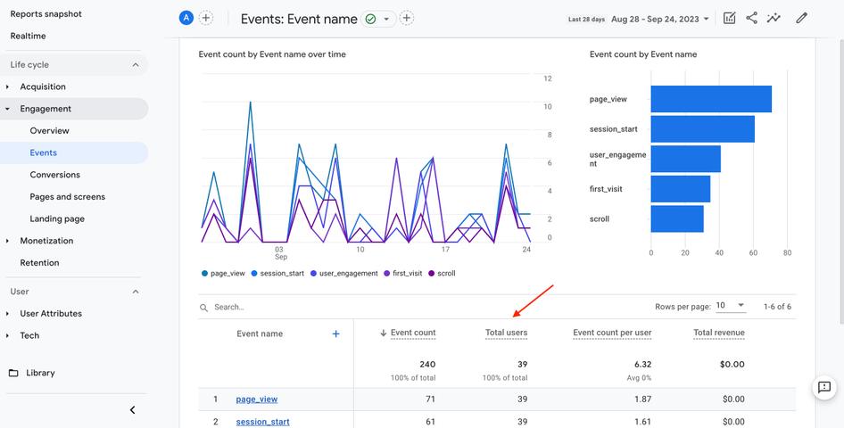
To find your total users, go to Reports > Engagement. Then, click on Events. (In Google Analytics, an event is a specific interaction a user has with your site or app. For example, they might start a session or scroll down the page.)
On the Events page, there’s a breakdown of every type of action each person takes on your site. For example, you might learn that 400 out of 7,000 total users watch your embedded video on the homepage—leading you to brainstorm ways to get that number up.
3. New users
In Google Analytics 4, a new user is someone who’s visiting your site for the first time. This is logged as a ‘first_visit’ or ‘first_open’ event.
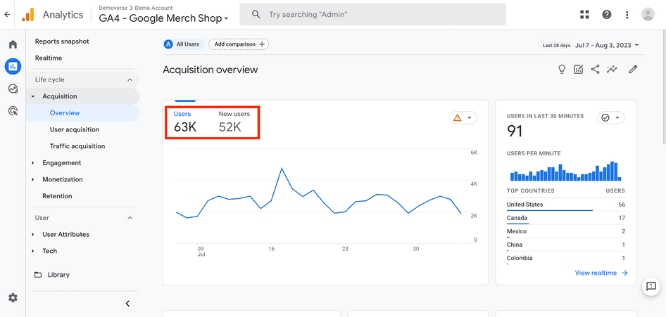
View your new user metrics by clicking on Reports > Acquisition. You’ll see an overview that provides you with an at-a-glance understanding of how many new visitors your site’s attracting.
💡 Pro tip: also gain valuable insights from the User acquisition page, which shows you exactly where your new users come from—i.e. direct (by entering your URL into the search bar), organic social, or organic search. Below that, it lists user engagement per source.
Viewing your new user metrics lets you gauge how effective your marketing campaigns are—and where you need to focus your lead-generation efforts to best connect with right-fit prospects.
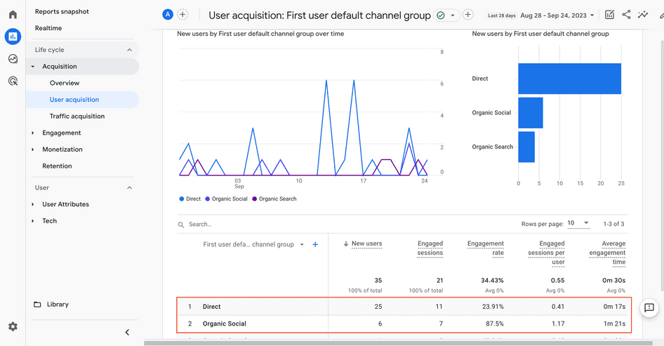
This site’s new users from organic social have a much higher engagement rate than those from direct or organic search
4. Returning users
The only thing that’s better than new users are ones who return to your site or app again and again. Why? It’s not only that retention costs less than acquisition. It’s also a great sign that your users are satisfied—delighted, even—and well on their way to loyalty.
In Google Analytics 4, returning users are people who have previously visited your website or app. If they stopped by at least once before—even if they didn’t engage during that session—they are returning users.
To access an overview of your returning users, click on Reports > Retention. Then, start by comparing new vs. returning users within a specific time period.
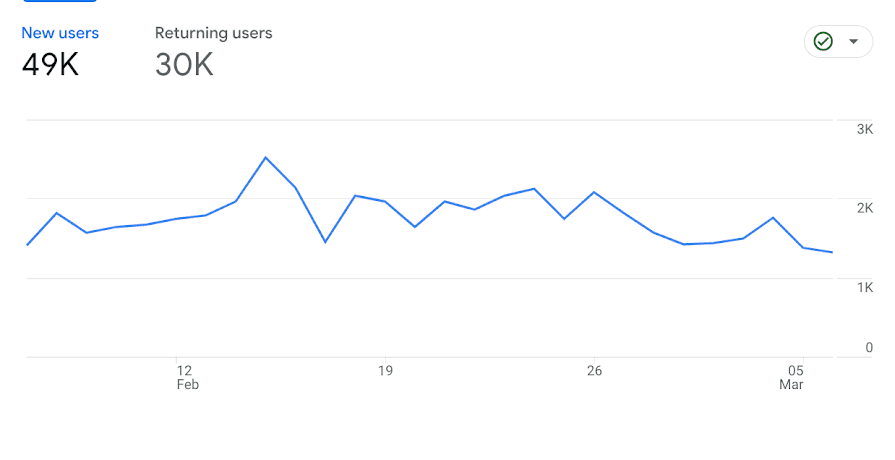
A graph allows you to compare new users to returning users within a specific timeframe
💡 Pro tip: find additional metrics about returning users on the user engagement chart on the Retention overview page. The chart shows you how well your site or app engages returning visitors, letting you gauge whether you’re meeting their needs, so you can make changes that help you reduce your bounce rate.
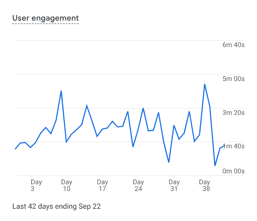
The user engagement chart shows the average daily engagement time of users who return within 42 days
What you can’t learn about users from GA4
Google Analytics 4 is a powerful platform that gives you your product’s number of users and how their activity trends over time—but it can’t provide rich contextual data that tells you why users behave the way they do on your website or app.
In GA4, you can’t learn
How users think or feel as they browse your app or site
Why they click the call to action (CTA) at the bottom of your landing page
Why they keep scrolling—and what makes them drop off your site
How satisfied they were with their experience on your site or digital product
Why some users bounce within seconds
What frustrates them (think aggressive pop-ups, not rush-hour traffic)
What else they want to see on your web app or site
That’s the data that helps you better understand your users and improve the experience for them.
But we’ve got good news for you (and your users): Hotjar’s tools pick up where Google Analytics 4 leaves off. That means you can use the Hotjar-Google Analytics integration to gather all the UX data you need to ensure your users are happy campers who stick around. Here’s how.
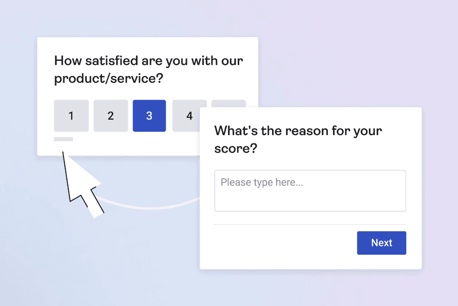
1. Surveys
Sometimes the best way to gather info about your users is to ask them. In minutes, you can create and launch a Hotjar Survey to follow up on what you see in GA4. Try these examples:
If GA4 shows a dip in active users → launch an exit-intent survey to determine why users leave without engaging
If GA4 shows that most of your traffic comes from direct search → launch a traffic attribution survey to dig deeper and learn how these visitors really heard about you—whether from a banner ad or their neighbor
If GA4 shows a spike in returning users → launch a customer satisfaction survey (CSAT) to gauge how satisfied they are and why
(Need more ideas? We have dozens of survey templates to get you started!)
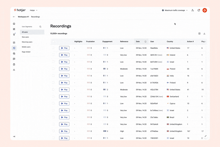
2. Recordings
When you look at your metrics in GA4, it’s easy to think of users in the most impersonal sense. Each user is a dot—or a tiny fraction of a dot—on a line graph.
To maintain a customer-centric perspective, you have to empathize with the individual people on the other side of the screen and find ways to optimize your site for them.
Hotjar Recordings lets you watch sessions of individual users interacting with your site—so you can experience every click, mouse movement, and scroll with them. You see what makes them pause—preventing them from progressing on their journey—and what prompts them to keep scrolling and clicking.
Showing clients analytical numbers about what happened and where isn’t always enough. When I introduced visual insights into ‘why’ shoppers behave certain ways, specifically session recordings, I saw jaws drop and excitement build.
While GA4 shows you that your total users have dropped, recordings show you a user’s wild mouse movements as they try to navigate a carousel, or rapid rage clicks as they attempt to open a non-clickable element.
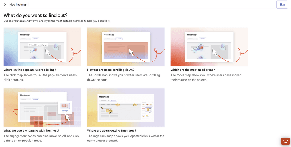
3. Heatmaps
GA4 crunches the numbers on user engagement—but you need another tool to dig into the context of what’s going on.
Use Hotjar Heatmaps to visualize how users engage with your pages and evaluate your marketing efforts. Turn to
Click maps to see what users click on
Scroll maps to see how far they scroll
Move maps to see where they moved their mouse
Engagement Zone maps to see the most (and least) popular spots on your page
Rage click maps to see where users get frustrated, clicking in quick succession
By analyzing heatmaps, you know exactly what active users enjoy about your site (and what frustrates them or interrupts their journey)—so you can find ways to improve their experience.
For example, GA4 might show you how many users click a CTA, but with heatmaps, you can see the number of people who stopped scrolling before they even made it that far—and any non-clickable elements they tried to click on before they gave up.
4. Trends
GA4 provides a ton of meaningful quantitative data. But what if you want to see your top metrics—and get answers to all of your ‘why’ questions—all in one spot?
Hotjar Trends lets you create custom metrics, and compare them against each other over time. You can use user attributes to create a key performance indicator (KPI) just for a single segment your team is focusing on. Display these metrics as bar graphs, line graphs, or pie charts—whatever helps you best spot usage patterns and conversion rate trends over time.
The best part? When you spot an interesting data point, you can ‘zoom in’ to learn more. Click through to related recordings and heatmaps to discover exactly what’s going on and why. For example, say you’re measuring metrics like product adoption rate after a UI change. Track the metric in Trends—and go directly to the contextual insights if you notice a dip.
Put your users first with GA4 + Hotjar 🤝
When it comes to gaining insights on your users, Google Analytics and Hotjar are a powerhouse duo. By using GA4 to collect detailed quantitative metrics—and Hotjar to supply the necessary context—you learn exactly who your users are, what they need, and why. With this info, you can optimize your website or web app, increase users, and create an experience that delights.
Understand what users do on your website
Use GA4 to tell you who visits your site—then use Hotjar’s tools to see how they behave once there.