Learn / Blog / Article
How to analyze survey data and get to know your customers (without any headaches)
If you don’t understand your customers, it’s almost impossible to improve your product or service for them.
Online surveys make it easy to get to know your users, but even a short, simple survey can leave you with a headache-inducing amount of user data to sort through.
So how do you make sense of it all? Read on to know how to conduct effective survey data analysis.


It can feel daunting not knowing how to analyze data from a survey you carefully crafted and posed to customers. There’s certainly an art to extracting actionable insights from customer feedback to help you improve your product or service for your users. Thankfully, that art can be learned.
This article looks at the different methods you can use to analyze and make sense of your survey results. We cover:
Create a survey today, analyze results tomorrow
Hotjar has all the tools you need to run a survey, analyze survey data, and improve your customer experience within days.

The golden rule of surveys: start at the end
Before we dive into how to analyze survey data, let's look at the big picture: while understanding traditional metrics and statistics can be helpful for analyzing customer survey results, the real key isn’t analysis—it’s planning.
To get meaningful user feedback, you need to ask the right survey questions. And to know what the right survey questions are, you should start at the end and establish clear goals.
Ask yourself:
What’s the one problem we need to solve, or the one question we need to answer, above all else?
Which customer segments can give us this insight?
When and where should we ask them about it?
What type of survey would best achieve this?
With a clear understanding of the information you need, you can decide which questions to ask and determine how to conduct your survey.
Then, after you collect actionable survey data from relevant audience segments, your next step is to decide which kind of survey analysis to perform.
Here, it’s important to choose your analysis methods according to the type of questions you ask and the type of data you gather. For example:
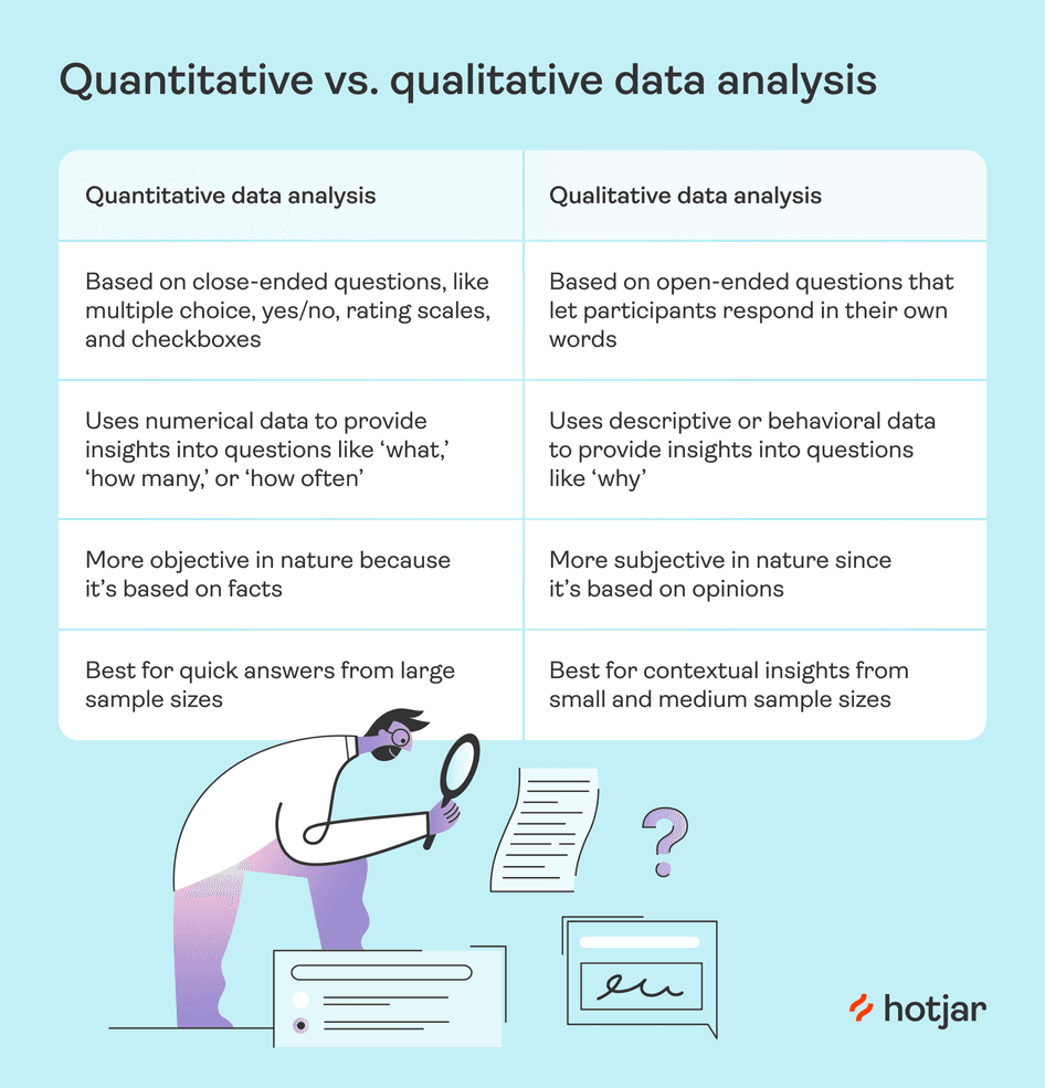
1. Closed-ended questions give you quantitative data (i.e. numerical data) that you can analyze with graphs, charts, and comparison tables. Respondents have to answer in a specific way, like giving a 'yes' or 'no' answer, selecting a 1–5 rating, or choosing from predetermined responses.
Use closed-ended questions to measure and compare what your users think or feel about a specific issue. Closed-ended questionnaires are one of the most effective ways to carry out customer satisfaction surveys.
2. Open-ended questions give you qualitative data (i.e. descriptive, word-based data), so you can identify trends and organize responses into groups and categories. Respondents can answer in any way they choose, in their own words.
Use open-ended questions when you want to dig deeper and find out why users think, feel, or behave a certain way.
🔥 If you're using Hotjar
There are many online survey tools out there to turn to for your survey needs, and we’re pretty proud to recommend our own. Hotjar Surveys lets you create and run a survey in minutes, especially when you start building from one of our survey templates.
Want to make the process even faster? Watch as AI for Surveys generates a survey based on your research goal in seconds.
5 ways to analyze quantitative data
These five methods will help you get valuable insights from quantitative survey data:
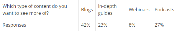
1. Make simple comparisons to identify customer preferences
If you ask a multiple-choice question in your survey, the answers will help you identify specific customer preferences (e.g. when you're testing a new product feature, service, or design).
To analyze comparative data, add the total number of responses for each multiple-choice option. Then create a comparison chart to organize the number of responses or percentages for each answer:
This kind of comparison is often easier to understand if you display it in a bar graph or pie chart:
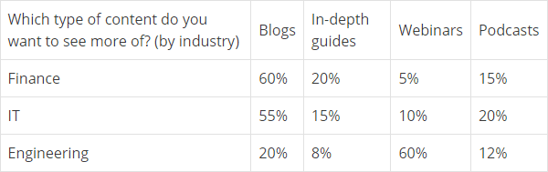
2. Use cross-tabulation charts and graphs to compare results from different audience segments
If you include survey questions that let you categorize respondents by demographic, you can see how different audience segments answer the same question—for example, how answers vary by age group or industry.
To analyze these responses, use a cross-tabulation chart to compare answers from each segment:
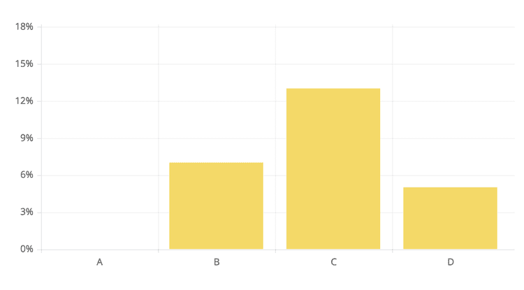
3. Analyze scale data using mode, mean, and bar charts
If your survey asks users to answer by selecting from a scale, you can measure how strongly customers feel about specific topics, product features, or services you provide. This type of question is also a great way to understand the customer experience.
For example, you might ask survey respondents to choose from a likert scale involving numbers:
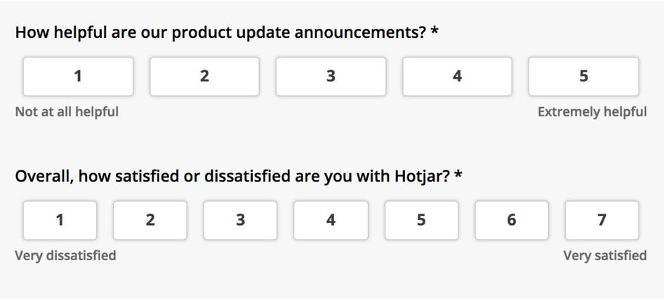
Or you can use a more descriptive scale:
In either case, one of the easiest methods to analyze scale survey data is to create a bar chart showing response rates.
Using a spreadsheet editor like Excel or Google Sheets, enter the names of each response in one row, then add the frequency it was selected in the corresponding row above. You can then create a bar chart that looks something like this:
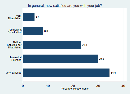
A bar chart showing how respondents answered a question using a five-point scale (Social Science Computing Cooperative)
If your scale involves numerical responses (e.g. a 1-7 rating), there are two other easy ways to analyze the data:
1. Calculate the mode
Mode represents the most common answer that appears in a set of data and can give you a quick snapshot of which rating on the scale respondents chose most often.
You can calculate mode in a spreadsheet with the MODE formula function. Select a blank cell, type =MODE into the formula bar, then select the cells containing the individual responses from survey data.
2. Calculate the mean
The mean is what we generally refer to when we say ‘average’. You can calculate it by adding up all the scores and then dividing the total by the number of responses.
Using the mean gives you a figure representing the typical response, which is helpful if you want to compare how customers’ responses to the same question change over time.
There's some debate about using averages to analyze scales, but we'll leave it up to you to decide whether this method will work for your survey analysis.
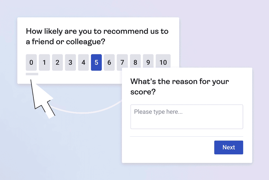
4. Calculate your Net Promoter Score® using a simple formula
When you ask customers how likely they would recommend your product or service on a 0–10 scale, you can use the responses to calculate your Net Promoter Score® (NPS).
NPS is represented as a number between -100 and +100 and is considered a practical gauge of customer satisfaction and loyalty. However, it’s typically calculated using a different methodology:
How to calculate your Net Promoter Score®:
Add up the promoters (those who respond 9 and 10)
Add up the detractors (those who respond 0 to 6)
Calculate the percentage by dividing the number of promoters by the total number of responses
Repeat step 3 for the detractors
Apply the NPS formula: percentage of promoters minus percentage of detractors
You can also find your score using our handy (free) NPS calculator tool. For a more detailed breakdown, read our guide for calculating your NPS.
🔥 If you're using Hotjar
There's no need to go through the process of manually calculating your NPS: Hotjar automatically calculates your Net Promoter Score® and gives you a visual breakdown in your survey response tab.
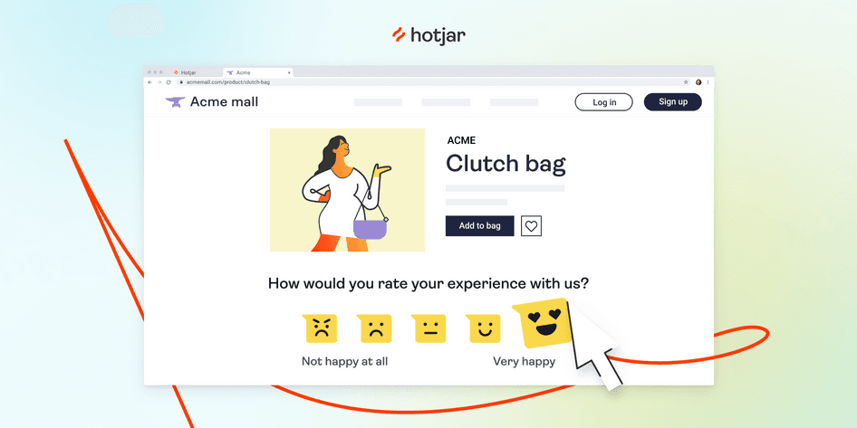
You can also use our NPS survey template to get started now.
An example NPS survey
5. Use benchmarking to compare your data with industry averages or with your previous results
When you’re analyzing quantitative survey data for the first time, it can be hard to tell whether the numbers are as good or bad as they seem.
For example, you might learn that your landing page's conversion rate is 12%, which seems low. But if you then learn that the average conversion rate in your industry is 8%, suddenly you’re doing pretty well (yay!).
This is called 'benchmarking', and it’s a great way to interpret your data in a helpful context.
You can learn a lot more from your survey data by benchmarking it with past results.
For example, if you compare your current Net Promoter Score® against your score from six months ago, rather than labeling your score ‘good’ or ‘bad’, you can get a clear picture of progress over time.
🔥 If you’re using Hotjar
While viewing survey response data, filter the results by date to compare answers from different time periods.
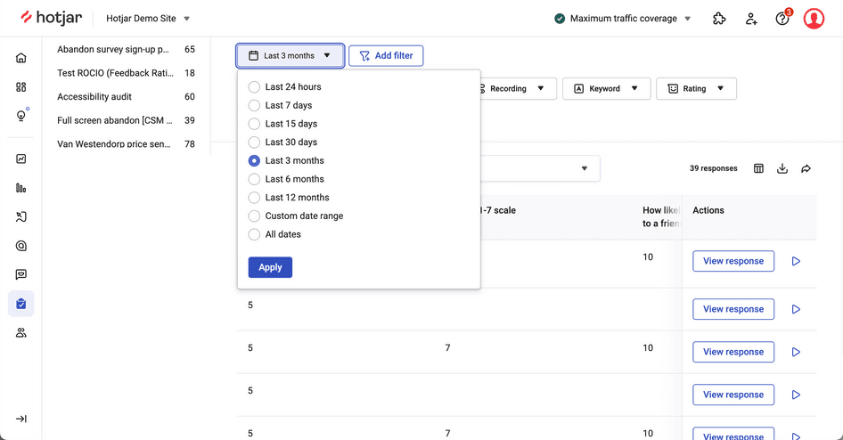
How to compare survey data over time with Hotjar
Using the information gathered from Surveys helped us make substantial changes that resulted in a +491% increase in email CTR and a +49% conversion rate increase for our landing pages.
3 ways to analyze qualitative insights
Qualitative data is often most helpful when used to support and explain quantitative data.
Here are three easy ways you can analyze insights from raw qualitative survey data:
1. Create visual representations of survey data
Qualitative data from surveys often involves hundreds or thousands of unique answers. (We feel your pain.)
One great way to process this information is data visualization: for example, you could generate a word cloud from terms that frequently crop up in responses. While word clouds won’t necessarily provide a definitive answer to a question, they can be a great jumping-off point for discussion.
2. Read individual responses to uncover hidden insights to shape your product and messaging
Qualitative data analysis isn’t always about spotting trends: it’s also about uncovering the motivations, objections, and desires that your audience won’t (or can't) tell you about directly.
Sarah Doody, Author of UX Notebook, used qualitative data to shape the messaging of her user experience (UX) training courses:
“A question I like to ask is this: ‘Before taking this course, the biggest challenges I faced were __________,’ or ‘the thing that was holding me back was ___________.’”
When asking questions like these, you’re likely to get many different answers. It can seem overwhelming, but taking the time to read each response can give you a deeper understanding of what your audience really needs from your product.
3. Turn qualitative insights into quantitative data
If you have enough qualitative survey data, you can sort your responses into categories and use them to create graphs, tables, and charts. To learn how to do this, read our guide on analyzing open-ended questions in five steps.
Here are the five steps in short:
Add your responses to a spreadsheet
Look for ways to categorize individual responses
Assign each response to a category
Organize your survey data by categories
Represent your data visually
🔥 If you're using Hotjar
Responses to survey questions aren’t the only type of quantitative data to look at: use Heatmaps and Recordings to discover whether users encounter issues like confusing navigation, website bugs, or broken elements.
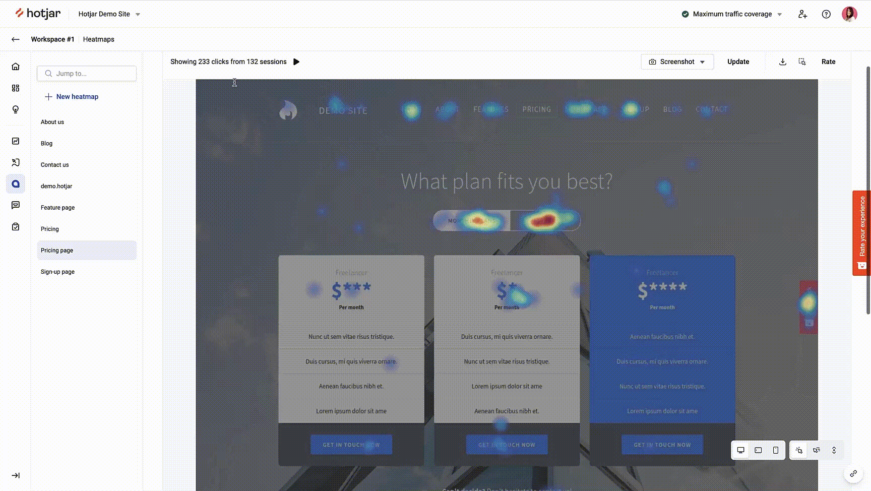
Tools like Hotjar Heatmaps provides more context behind user behavior
Create a survey today, analyze results tomorrow
Hotjar has all the tools you need to run a survey, analyze survey data, and improve your customer experience within days.
7 steps to analyze survey results from scratch
1. Establish your analysis goals
Start by deciding the key research questions you want to answer with your survey data. This will help you determine which data points to analyze, and in which order.
2. Remove any incomplete or unreliable data
If your survey asks multiple questions, you might find that respondents skip some questions or leave fields blank.
This isn't always a problem, but if you’re trying to compare how respondents differ in their answers to multiple questions, incomplete responses may skew your results. In this situation, it’s better to remove the incomplete responses.
🔥 If you're using Hotjar
When viewing your survey data in the Results tab, use filters to remove incomplete answers from your analysis.
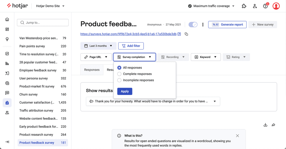
Filter out incomplete survey responses in Hotjar
3. Look for trends in your quantitative data
Start by looking at the quantitative data that ties most closely to your statistical analysis goals.
For example, imagine you have a SaaS product and you want to understand why more users aren’t signing up for a paid plan after completing a free trial. To find out, you might ask free trial users to rate how useful they find the product.
Now imagine the survey data says 70% of trial users found the product useful. Your conclusion might be that the product isn’t the reason that trial users aren’t continuing.
Looking for trends in this way allows you to hone in on the problem through a process of elimination.
The main stakeholders in our business want to keep track of product performance. We use Hotjar Surveys to see how satisfied our customers are with our products, and we report the larger trends.
🔥 If you're using Hotjar
Dig deeper and better understand user behavior by comparing data from on-site surveys and session recordings.
Place an on-site survey on the page (or pages) you want to investigate, analyze the survey data, then watch session recordings of users on the same page(s) to see how they experience and interact with your site.

Hotjar Recordings capture the full user journey to contextualize survey data
You can also test this in reverse order. First watch session recordings of the page(s) in question to identify blockers or UX issues, then use on-site surveys to ask direct questions and discover ways to improve UX and the customer experience.
4. Check that your findings are statistically significant
Drawing meaningful conclusions from quantitative survey data can be tricky. Data often suffers from ‘noise’ because people sometimes make mistakes when entering their answers.
If you only have a handful of responses, that ‘noise’ carries a margin of error that will affect survey results even more. The less data you have, the less likely it is that your findings will have statistical significance.
Use our sample size calculator to check that your data pool is big enough to trust the validity of the insights you’re finding, and make sure you’re not jumping to conclusions in your data by assuming that correlation means causation.
5. Compare your quantitative data against previous benchmarks
Whenever possible, try to get a frame of reference for interpreting your data. Looking at historical data can help you make sense of the trends you identify.
Let’s go back to the example of a SaaS company trying to understand why free trial users aren’t signing up for a paid plan:
Your company might compare its results against benchmarks from a similar survey the previous year.
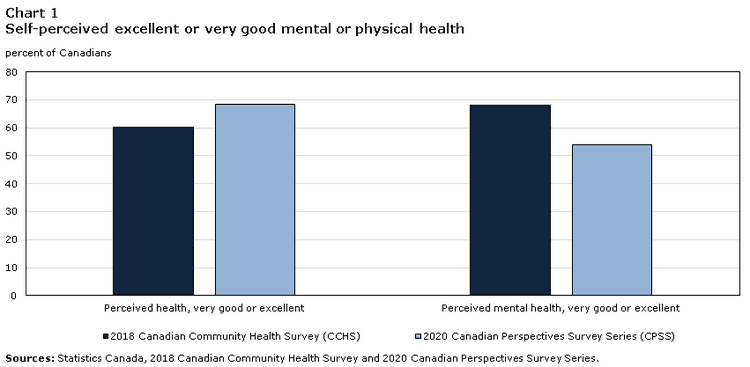
A graph comparing survey results from two different years (Statistics Canada)
Now let’s imagine that trial users find the product more useful in the current year than last year, but paid sign-ups still haven't increased. This could indicate that you need to focus on optimizing other factors—like customer experience (CX) or pricing—instead of further developing the product.
6. Use qualitative data to support and explain your quantitative data findings
Using quantitative and qualitative survey data together can help you build a complete picture of what’s happening—and of what customers need from your product.
Where quantitative data analysis often reveals audience trends and preferences, qualitative data analysis can reveal the why behind them.
Let’s apply this to the same SaaS company that wants to determine why free trial users aren't becoming paid users:
By asking a closed-ended question, you identified that 70% of trial users found the product useful, which indicates that the problem probably isn't with the product itself.
If you also asked an open-ended question like “What’s stopping you from signing up to our paid plan?”, you could sift through the answers to discover that trial users also objected to the pricing.
🔥 If you're using Hotjar
Analyzing qualitative data just got easier, with Hotjar AI for Surveys.! To save time sifting through answers to open-ended questions, Hotjar AI will analyze your qualitative survey responses and summarize them in a concise report that includes key findings, quotes, and actionable next steps to take.
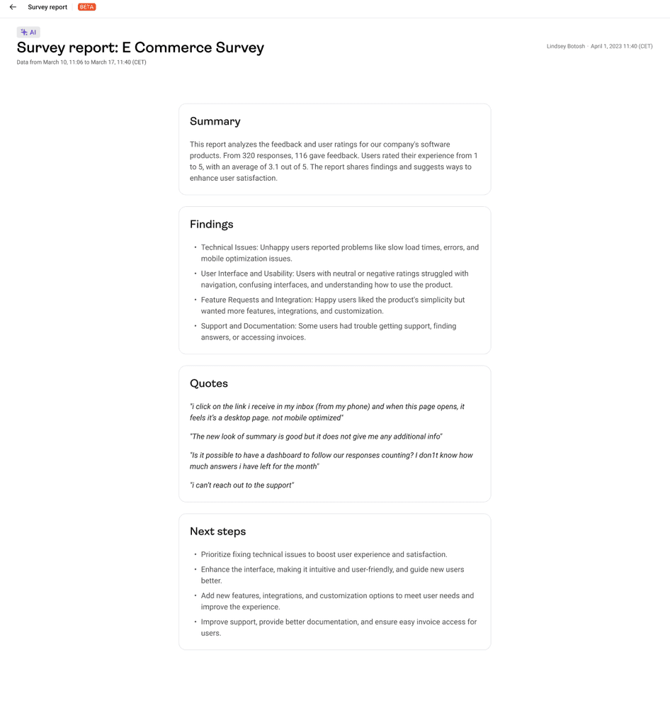
Hotjar AI for Surveys will generate a survey report that summarizes qualitative data insights
7. Present your findings to colleagues
After gathering actionable insights from your survey data, it’s time to share your findings with your team.
If you’re sharing your findings in a meeting, remember that it can be challenging for people to digest raw numbers quickly. It’s best to present your findings concisely with charts, graphs, or infographics in these situations.
However, if you’re creating a more detailed report that your colleagues can read in their own time, you can include some more in-depth breakdowns of figures.
🔥 If you're using Hotjar
Bring the voice of your customers to your team using Hotjar’s integration with Slack or Microsoft Teams. When you create a survey, toggle on Slack or Microsoft Teams under 'Forward Response' and select which channel(s) you want to send your survey responses to.
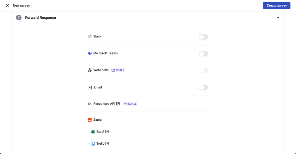
Select where you want to share responses while creating a Hotjar survey
Creating a helpful narrative
Whether you’re putting together a visual presentation or a detailed report, try to create a narrative around your surveySA analysis. Take your team members on the same journey you experienced to reach your conclusions (but feel free to skip any analyses that weren’t helpful or conclusive).
Start by stating your goals, and what prompted you to conduct a survey in the first place. Then, present your datasets in an order that supports your analyses.
In the SaaS company example, you:
Identified a key trend with quantitative data
Used historical benchmarking to eliminate one possible explanation for the trend
Looked at qualitative survey data to identify pricing as another possible explanation
Harnessed other data (from heatmaps and session recordings) to connect the dots and further verify your findings
How to avoid jumping to the wrong conclusions
A common mistake when analyzing surveys is jumping to conclusions about what causes a particular trend. Statistically-savvy readers often refer to this error as ‘confusing correlation with causation’.
For example, imagine you're gathering data on why restaurants go out of business. Your data might reveal that, surprisingly, every restaurant that failed used cutlery.
You have two pieces of data here:
The number of restaurants failing
The number of restaurants that use cutlery
When you put these two datasets together in a graph, it shows that 100% of restaurants that failed used cutlery—so the datasets seem to have a relationship (i.e. they're correlated).
But it wouldn't make sense to argue that having cutlery was causing the restaurants to fail.
So even though the two data pieces are correlated, it doesn’t mean one causes the other.
Avoiding the 'correlation vs. causation' error in your analysis
Make sure you’re not jumping to conclusions with your analyses. Take every factor into consideration that could influence trends, and use qualitative data to uncover the factors you hadn’t thought of. Also, challenge assumptions by looking for data that disproves them.
For example, imagine your benchmarking shows
Customer satisfaction with your product has gone down since the previous year
Your company updated your product’s features in the previous year so you conclude the updates caused the downturn in customer satisfaction.
There's the error.
Even though the two factors—customer satisfaction and product features—changed at the same time, it doesn’t necessarily mean one was causing the other. It could be that customer satisfaction was affected by customer support issues, website loading speed, or any number of different factors (which may have had nothing to do with your product updates).
Use web and behavior analytics tools to investigate and understand what's happening on your website to avoid acting on assumptions—and find out the real reason for the drop in customer satisfaction.
Final thoughts
Analyzing survey data helps you understand customer behavior and track how your company is performing, but working with large amounts of data can quickly become overwhelming.
Keep things simple, and remember to
Design your surveys with clear, simple goals from the beginning
Use quantitative data to spot initial trends, then use qualitative data to look for more in-depth explanations
Make sure your conclusions are valid by using benchmarks, checking that your sample size is big enough, and considering correlation vs. causation
Create a survey today, analyze results tomorrow
Hotjar has all the tools you need to run a survey, analyze survey data, and improve your customer experience within days.
FAQs about analyzing survey data
Related articles

User research
5 tips to recruit user research participants that represent the real world
Whether you’re running focus groups for your pricing strategy or conducting usability testing for a new product, user interviews are one of the most effective research methods to get the needle-moving insights you need. But to discover meaningful data that helps you reach your goals, you need to connect with high-quality participants. This article shares five tips to help you optimize your recruiting efforts and find the right people for any type of research study.

Hotjar team

User research
How to instantly transcribe user interviews—and swiftly unlock actionable insights
After the thrill of a successful user interview, the chore of transcribing dialogue can feel like the ultimate anticlimax. Putting spoken words in writing takes several precious hours—time better invested in sharing your findings with your team or boss.
But the fact remains: you need a clear and accurate user interview transcript to analyze and report data effectively. Enter automatic transcription. This process instantly transcribes recorded dialogue in real time without human help. It ensures data integrity (and preserves your sanity), enabling you to unlock valuable insights in your research.

Shadz Loresco

User research
An 8-step guide to conducting empathetic (and insightful) customer interviews in mid-market companies
Customer interviews uncover your ideal users’ challenges and needs in their own words, providing in-depth customer experience insights that inform product development, new features, and decision-making. But to get the most out of your interviews, you need to approach them with empathy. This article explains how to conduct accessible, inclusive, and—above all—insightful interviews to create a smooth (and enjoyable!) process for you and your participants.
Hotjar team