Learn / Guides / Quantitative data analysis guide
6 examples of quantitative data successful businesses track
You’ve probably heard the famous management maxim, “What gets measured gets managed.” If you can put hard numbers on your business variables, it’s that much easier to tell if they’re performing as normal, driving success, or a cause for concern.
Tracking quantitative data—metrics you can measure with numbers—is one of the cornerstones of any good business strategy. But to unlock the full power of your numbers, you’ll need to contextualize them.

This article shares six quantitative data examples from real companies, and how they analyzed these metrics to guide profitable decisions.
We also look at a bonus case study proving why quantitative data is best paired with a cool glass of qualitative insights.
All your most important data, in one place
Hotjar allows you to compare quantitative and qualitative customer data, so you can investigate ways to increase your bottom line

6 quantitative data examples from real businesses
Here are six success stories from companies that crunched the numbers and used the information they gained to make highly profitable business decisions.
1. Materials Market tracked and improved their cart abandonment rate
💭 Who? Materials Market, an ecommerce business connecting construction industry professionals with the materials they need
📈 Quantitative data tracked: cart abandonment rate
🎓 Important learning: 1 in 4 users abandoned their carts
If you run an ecommerce business, keeping tabs on your cart abandonment rate is essential. Examining data from Hotjar Recordings, Materials Market co-founder Andrew Haehn noticed that a quarter of visitors who added items to their cart did not complete the checkout process.
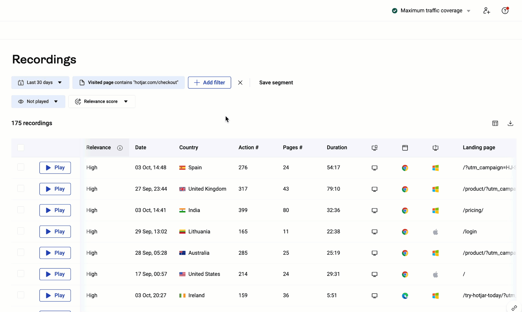
Hotjar’s clicked element filter lets you find recordings of users who started—but didn’t finish—the checkout process to find out why they don’t convert
These high numbers were a clear indication of a problem with the checkout flow. Andrew hypothesized that the process—which involved creating an account—was simply too long and involved for busy professionals.
He simplified the checkout page, and the data speaks for itself. Before, 1 in 4 users dropped at checkout. Now it’s only 1 in 25.
2. Gogoprint assessed its sales funnel to boost conversion rate
💭 Who? Gogoprint, an online print services provider
📈 Quantitative data tracked: conversion rate
🎓 Important learning: one web page in particular was responsible for a high volume of users dropping off the sales funnel
No matter what industry you’re in, conversion rate—the percentage of visitors or leads who go on to do business with you—is one of the key numbers to track.
Piriya Kantong, a Senior Online Marketing Analyst at Gogoprint, used Hotjar Heatmaps and Recordings to analyze each page a user sees while moving through their sales funnel: landing pages, product pages, and the checkout page.
The numbers revealed that one page saw the most drop-offs.
Once the team identified the problem page, they created a new version. In a split-test, this updated version returned 7% fewer drop-offs—leading to a conversion increase of 2%.

💡Pro tip: the Hotjar Funnels tool helps you understand why and where users drop off from your conversion funnel.
Log each step in your customer journey into Funnels. Over time, the tool collects both quantitative data (how many customers progress to each stage) and qualitative insights (such as screen recordings) to show you what those actions look like and where users get stuck.
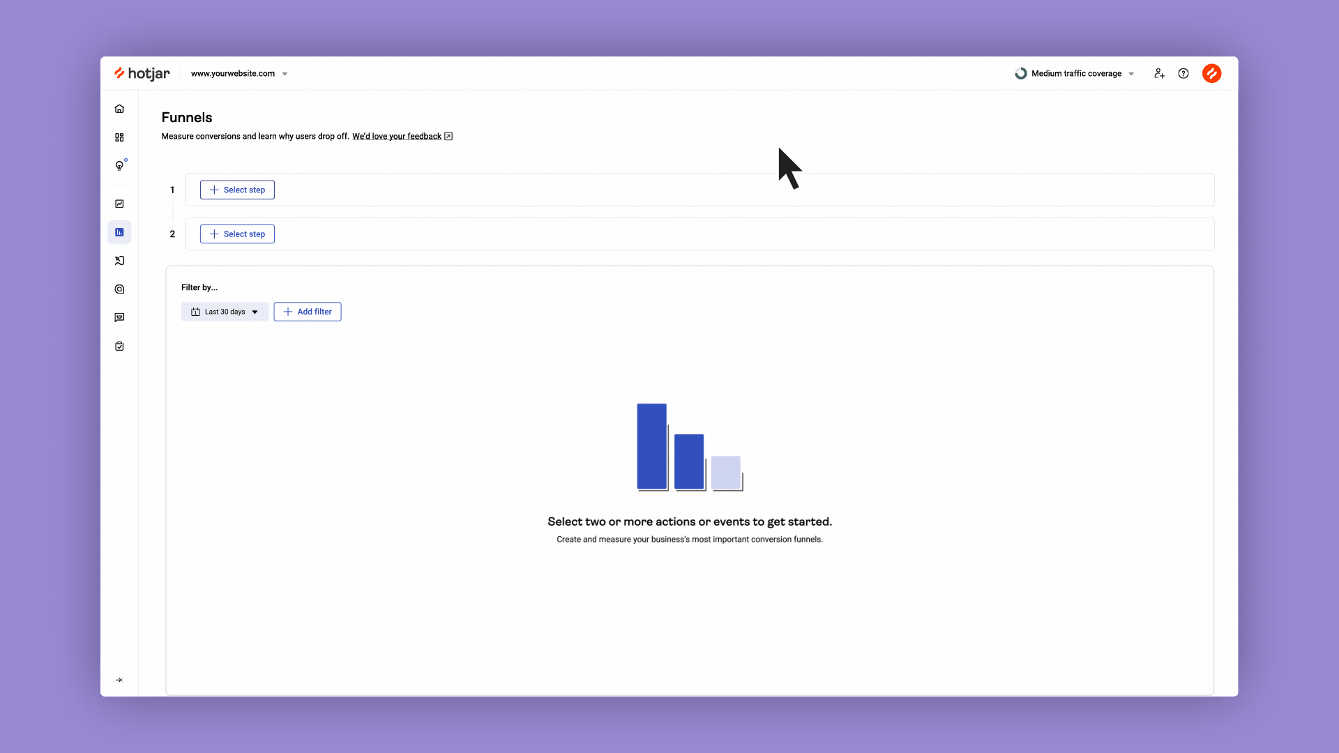
Hotjar Funnels makes it easy to analyze and optimize the performance of all types of funnels
You’ll have all the information you need to thoroughly analyze where you’re losing customers—and understand what needs to change if you want to keep them.
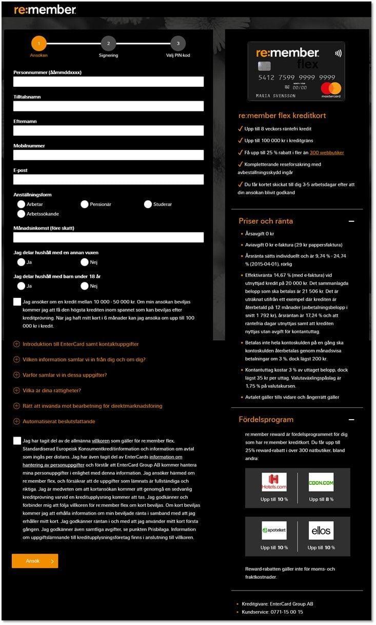
3. Re:member counted their page clicks and uncovered a user pain point
💭 Who? Re:member, a Scandinavian credit card company
📈 Quantitative data tracked: total clicks
🎓 Important learning: several qualified leads landed on the sign-up page and repeatedly clicked on an unclickable element before leaving empty-handed
Even something as simple as counting how many clicks users take on important page elements can help you understand how to meet their needs better.
To view the number of clicks on a button using a Hotjar click map, just hover your mouse over the element
Steffen Quistgaard, a Senior Marketing Specialist, spotted that many qualified leads arrived on Re:member’s site via affiliate links, but didn’t complete the sign-up process for a credit card. So, he used Hotjar’s advanced filtering to view a click map of behavior from users who came via affiliate links.
He saw that many of these visitors tried to click the unclickable ‘benefits’ section of the form.
From this behavior, he deduced that these leads needed additional information before signing up for a credit card and were clicking to try and learn more.
Steffen and the team redesigned the application form to include clearer and more persuasive info—and form conversions from affiliate pages increased by a whopping 43%.
4. The Good measured bounce rate and learned how to decrease it
💭 Who? The Good, a conversion rate optimization (CRO) agency, and its ecommerce client, Swiss Gear
📈 Quantitative data tracked: bounce rate
🎓 Important learning: the mobile bounce rate was unusually high—something had to be wrong
It’s useful for every online company to be aware of its bounce rate—the percentage of visitors who leave without taking action. After all, you can’t do business with someone who doesn’t stick around long enough to understand your offer.
CRO agency The Good keeps tabs on its clients’ bounce rates via Google Analytics to determine if any pages are unappealing to new visitors. One particular client, travel equipment company Swiss Gear, had very high bounce rates on their mobile site.
So, they sought out qualitative data to find out why and fix the problem.
The Good used Hotjar Recordings to watch sessions of users interacting with the mobile version of Swiss Gear’s website. It was evident that users were confused by too much information and fiddly on-site content filters.
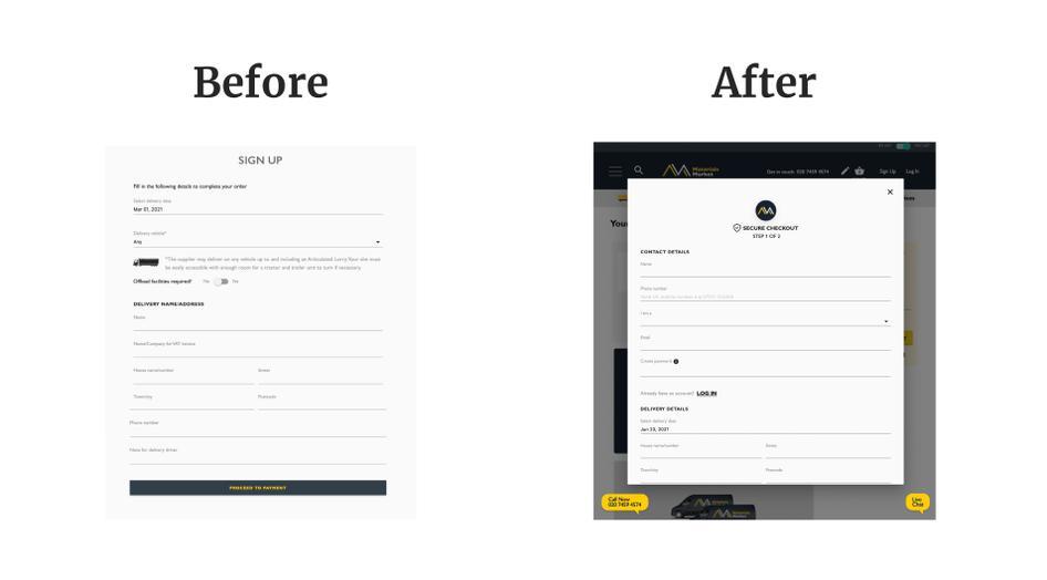
The Good A/B tested a pared-down, menu-driven mobile homepage for Swiss Gear, and this solution proved to be a roaring success: mobile user bounce rate shrank by 8%.

Swiss Gear’s beautifully simple new mobile homepage
💡Pro tip: to investigate the bounce rate on your site, be like The Good! Pair Google Analytics with Hotjar to understand the user behavior behind the numbers.
Set up our integration to send Google Analytics events to Hotjar and filter your screen recordings to view all user sessions that ended in a bounce.
You’ll see videos of what users’ screens looked like in the minutes before they decided to leave, helping you discover if there’s a recurring problem driving them away.
5. ClickMechanic studied the percentage of viewers on different page elements to improve their UX
💭 Who? ClickMechanic, a marketplace that connects car owners with local mechanics
📈 Quantitative data tracked: scroll depth
🎓 Important learning: 75% of users didn’t scroll past the hero image on their landing page
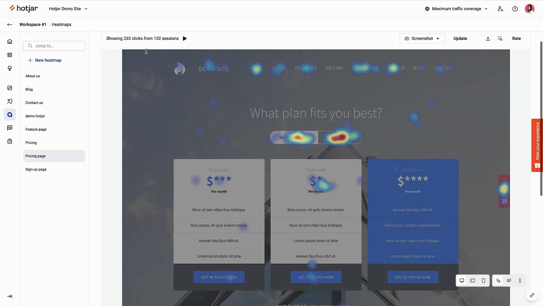
One overlooked data point is how far users typically scroll down your important pages. When ClickMechanic installed a Hotjar heatmap on their landing page, they realized 75% of users never saw anything below the hero image.
This meant that visitors usually missed most of the sales pitch—including the benefits of using ClickMechanic, and the logos of their important customers. D’oh!
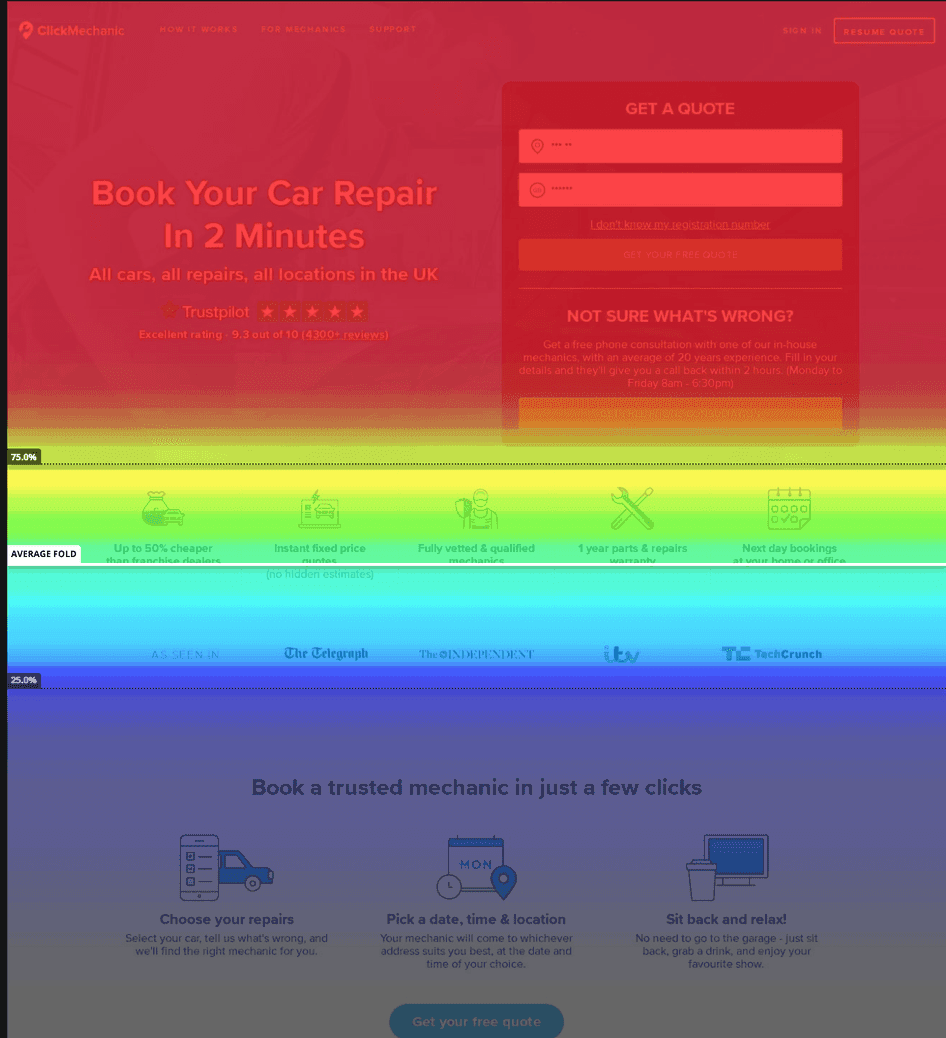
With these insights, the team optimized their landing page, moving essential elements and information above the fold. This simple change delivered a 15% increase in conversion rate.
6. Every.org examined rage clicks to plan a more effective conversion flow
💭 Who? donation platform Every.org
📈 Quantitative data tracked: number of rage clicks
🎓 Important learning: the donation page was frustrating users, causing many of them to give up instead of completing a payment
To uncover potentially costly bugs and elements not working as expected, many businesses also track the number of rage clicks—repeated clicks or taps on the same element—on their important pages.
Every.org analyzed their donation checkout page using Hotjar Recordings, filtering their data by rage clicks. Their discovery was an unusually high number of them.
Dave Sharp, a Senior Product Designer, realized something must be wrong. On inspection, he noticed two conflicting calls to action (CTAs) on one screen tripping visitors up. Users who hadn’t yet added a card (a necessary but unclear first step) rage-clicked on the ‘Donate’ button, and were confused when nothing happened.
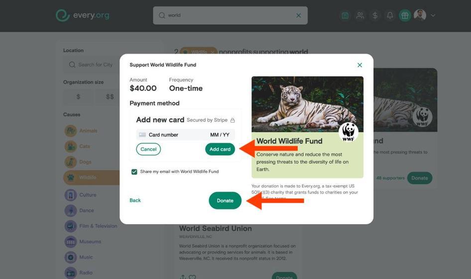
Dave and the team made the checkout flow clearer to navigate, and conversions increased by 29.5%.
Make the most of your quantitative data with triangulation
If you want to use data to make better, more profitable decisions for your business, quantitative data is only half the story. To see the full picture, you’ll need to analyze it alongside complementary qualitative data—research based on properties and characteristics.
Analyzing quantitative and qualitative data together is known as triangulating your data.
For example, consider the case of Hussle, who used data triangulation to create a successful win-back strategy for ex-customers.
Bonus: Hussle analyzed survey responses to develop a win-back strategy
💭 Who? Hussle, an online marketplace for gyms and spas
📈 Quantitative data tracked: churn rate
🎤 Qualitative data tracked: individual customers’ reasons for churning
🎓 Important learning: 26% of customers left to subscribe directly with just one gym, which was a better fit for their needs than buying a multi-gym pass
Online fitness company Hussle wanted to investigate its churn rate—the percentage of customers unsubscribing from their service. While the Hussle team knew how many customers churned, this knowledge alone wasn’t enough to help them decrease their churn rate.
Product Lead Luke Calton used Hotjar to set up a churn survey, asking ex-customers one simple open-ended question: why did you leave us?
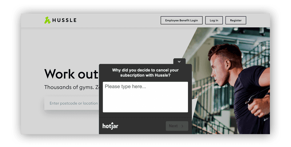
When more than 1,000 former Husslers answered the survey, Luke had enough data to spot patterns and cluster them into themes, then home in on the most common reasons for churn, turning qualitative insights into actionable quantitative data.
Luke analyzed all 1,000 survey responses to understand ex-customers’ thought processes, what mattered to them when choosing a gym marketplace, and how they talked about it. It turned out 26% of ex-users unsubscribed to join a gym directly—a useful quantitative discovery to help drive product decisions.
With these insights, Luke’s team created a new product, partnering with gyms to offer direct memberships, too. Problem solved!
Count on quantitative data
Tracking quantitative data is fundamental to understanding how your business measures up to the competition and how to plan for growth.
However, as we’ve seen, quantitative data is meaningless without context from its empathetic cousin, qualitative data. For best results, don’t view these two data types in isolation: gather your information with a platform that shows both side-by-side.
Hotjar allows you to cross-reference hard numbers with qualitative insights, empowering you with all the data you need to make great decisions that grow your customer base. Consider tools like customer interviews, open-ended survey questions, and recordings to give more meaning to your numbers (all available within the Hotjar platform, conveniently 😉).