Learn / Blog / Article
9 proven strategies to increase website conversions
Here’s the thing: converting more website visitors isn’t about trying out dozens of random tactics or industry best practices. Those might give you a temporary boost, but they won’t create lasting results.
That’s because the only way to improve website conversions in the long run is by understanding what your visitors need and how your website fits into that.


Increasing your website conversion rate—and keeping it high—is a huge contributor to a sustainable, healthy business.
But more often than not, doing this is a struggle and a mystery, so you need to unpack the causes of your low conversion rate and find long-term solutions. This article gives you the rundown of nine strategies to increase conversions, including tips to implement them and real-world examples to inspire you.
Learn why your visitors aren’t converting
Hotjar shows you what keeps your visitors from buying, so you can make website changes based on real insights, not assumptions, and watch your conversion rate grow.

9 techniques for a higher conversion rate on your website
To convert your visitors into customers, your website needs to:
Build trust to establish your business as a reputable brand with a secure checkout process
Give visitors essential information they need to make a purchase, from guides to product details
Convince them to buy from you instead of a competitor
Make their research, browsing, and buying experience smooth and delightful
Use one or more of these strategies to ensure your website does exactly that.
1. Send timely cart abandonment emails
According to cart abandonment stats, the main reasons people leave their online shopping baskets are high shipping costs, having to create an account, and a complicated checkout process.
But many customers are just browsing and don’t have an explicit reason to bail out of their shopping journey. “I’ll do it later,” they think, and then they get distracted by life, work, errands, or the worst option possible—your competitor.
Cart abandonment emails serve as reminders that gently bring them back to your checkout page.
How to implement this strategy
To add cart abandonment emails to your strategy, you’ll need an email service provider that offers a cart abandonment feature. Klaviyo, Privy, and ActiveCampaign are a few platforms you can start with.
If you’re using ecommerce platforms like Shopify, Wix, Squarespace, or WooCommerce, you can set up cart recovery emails through them, too.
Then, as you build and write your cart abandonment emails, consider a few elements you could A/B test to find what works best, like:
The timing of your cart abandonment emails
Formatting style
Subject line structure
🔥 If you’re using Hotjar: use the Trends tool to monitor how your abandoned cart metric and the related user behavior—like rage clicks and u-turns—changes over time.
Not only can you view the spikes and dips in your abandoned carts at a glance, but also instantly view the heatmaps, recordings, and feedback related to the changes so you can learn why they happened.
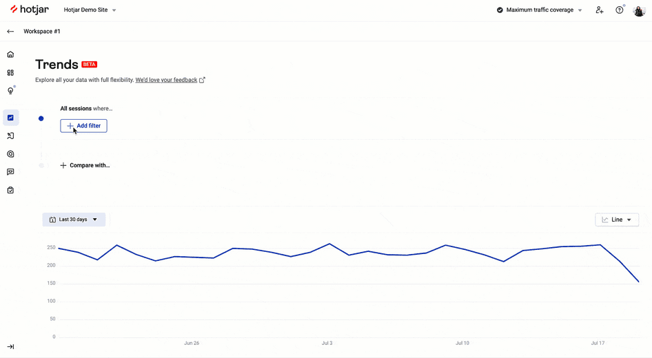
Hotjar Trends overview
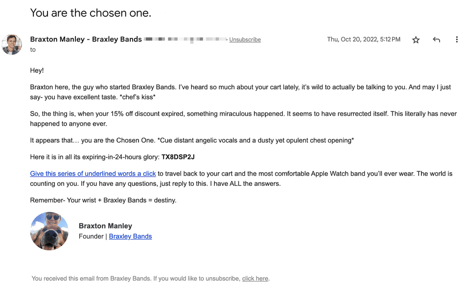
A cart abandonment email example to get you inspired
Your abandoned cart email reminders can be plainly formatted or feature a fully fledged design complete with your color palette, logos, and images. Your best choice depends on your brand’s style.
Here’s a cart abandonment email example from Braxley Bands, a brand selling stretchy Apple Watch bands. It’s written from the perspective of the company’s founder, with a witty tone and a discount code:
2. Offer value before asking for the sale
Your website conversion rate is a tricky metric because it tells you how many visitors have become paying customers.
But not every visit is meant to become a purchase. In many cases, people need to trust your brand before buying, or they need more time to make a final decision—buying a homeware appliance is a longer process than buying hand soap!
Depending on your industry or product type, converting first-time visitors might be a no-brainer. But if there’s any chance they need more trust and information before making a purchase, focus on giving them content that offers value and builds trust first.
How to implement this strategy
To figure out what content will help you convert more visitors, you need to work backward to understand what your users are craving and missing from your site or product. Our approach to conversion rate optimization (CRO) does this through three stages:
Drivers that bring people to your website
Barriers that make them leave
Hooks that persuade them to convert
Here’s how those ecommerce CRO stages overlap with specific research methods and tools (more on these tools later):
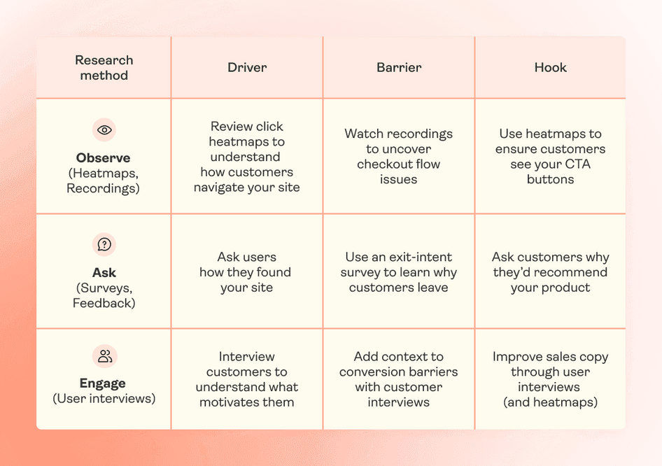
Your value-adding content needs to focus on bridging those barriers and directing visitors toward hooks. For example:
If visitors seem overwhelmed by the wide range of LED TVs you sell → offer shopping guides for different budgets, room sizes, and TV placements
If visitors don’t know how to choose the right dress size → offer measurement guides and charts for each of the styles you sell
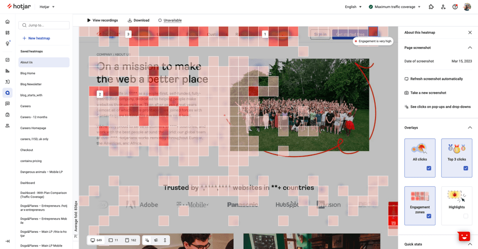
And if you already have some value-adding content but want to update it and create more resources to guide your visitors even better, use heatmaps to understand which elements of your content users engage with the most.
A value-adding example to get you inspired
There are many ways to give potential customers value through content: shopping guides, a glossary of key terms, a video series, an email sequence with ‘everything you need to know about [topic]', style tips, or a rich knowledge base.
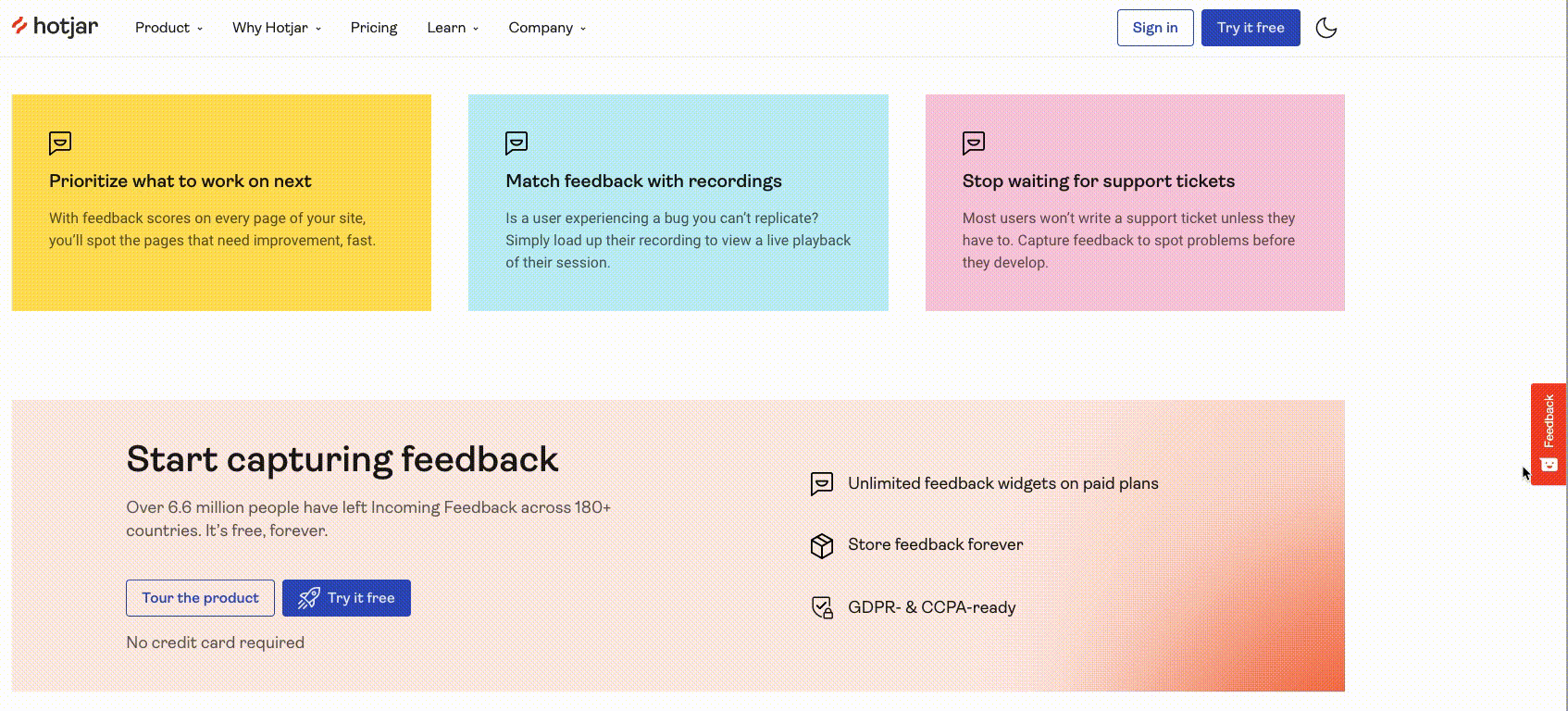
One of our favorite examples is Hotjar (that’s us 👋), a digital experience insights platform with tools like Heatmaps, Recordings, and Surveys that help product managers, marketers, and designers understand their users.
To enable online businesses to use the right tools and make the best product decisions, we offer:
A free monthly newsletter, which has over 100,000 subscribers
A library of over 50 guides
Webinars featuring everyone from influencers to SEO experts
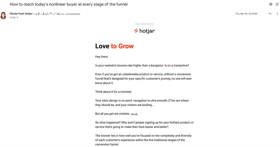
Hotjar’s Love to Grow monthly newsletter
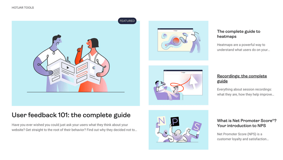
Hotjar’s library of guides on PX insights, behavior analytics, and tools

Hotjar’s page with live and on-demand webinars
3. Fix usability issues
Usability issues aren’t just the obvious errors like a broken link or a page that isn’t mobile-friendly. They can be sneaky and subtle—for example, an element might look clickable but go nowhere, a button may be hidden, the checkout form could throw a strange error, or a sizing chart might not load properly.
This strategy is about finding and fixing those small but impactful obstacles in your visitor’s journey.
How to implement this strategy
The best way to find usability issues is to run a usability test.
There’s a range of methods you can use to make this happen—lab usability testing, video interviews, and observation are a few—but the easiest way to get started is by analyzing session recordings.
Session recordings are renderings of real actions taken by visitors as they move through your website, meaning you can see what they see as they browse your products or view their cart, including what happened right before they abandoned checkout.
One of the best things about recordings in Hotjar is the option to filter them so you can focus on the most relevant ones. Use filters like rage clicks, u-turns, exit pages, and clicked elements to find the most burning issues and prioritize fixes that will make the biggest impact on your conversion rate.
A usability issue example to get you inspired
One brand that had issues with website usability is Intertop, a Ukrainian fashion retailer, who sought the help of Turum-burum, a digital UX design agency, to make the right fixes.
Turning to Hotjar Recordings to understand user pain points, they realized product filters weren’t working correctly—for example, shoppers who wanted shoes in size 42 would also be shown shoe models only available in sizes 43 and 44. This created friction and confusion, and it made users browse through many pages before they found the right product and size.
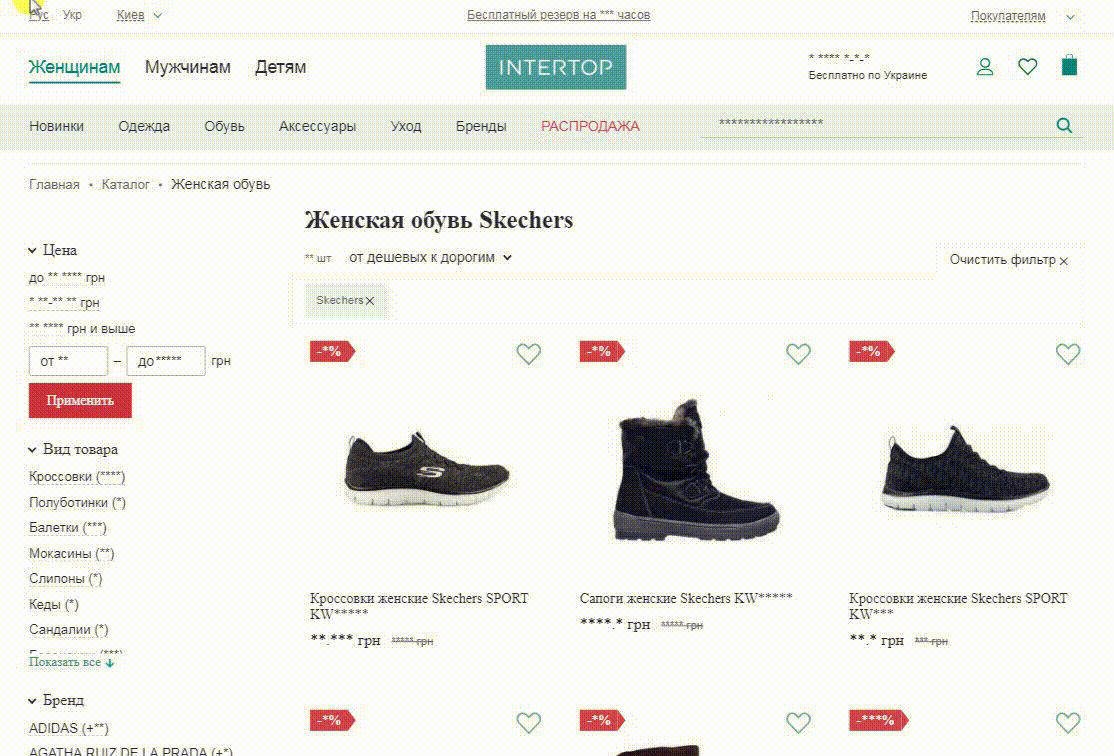
Having pinpointed the problem, Intertop made quick fixes that helped them increase their ecommerce conversion rate from product page to cart by 31%, and from cart to checkout page by 36.6%.
4. Survey visitors who are on the fence
Here’s a bold suggestion: if you only choose to implement one of all our nine strategies to increase conversion rates on your website, make it this one.
Seek explicit feedback from visitors who aren’t converting by triggering a targeted website survey at key customer journey touchpoints to reduce assumptions about what’s stopping them and get real customer insights.
How to implement this strategy
Set up a one-question survey on your website (see example below). With Hotjar, you can use specific triggers to launch a survey:
On specific pages, like your checkout, pricing, and landing pages
After a period of time has passed
When a user is about to leave the page
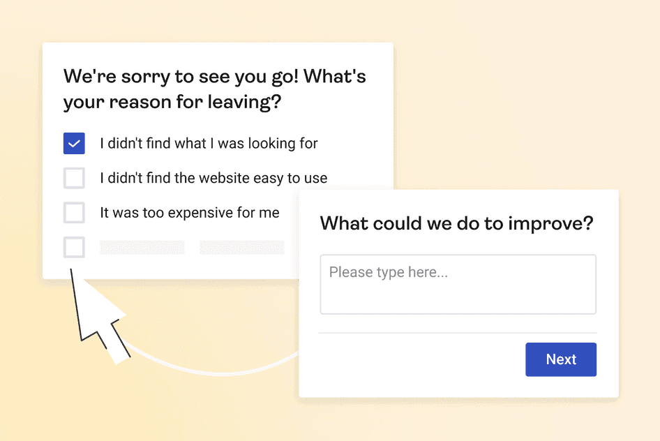
A survey example to get you inspired
ClickMechanic is a UK-based marketplace that connects local mechanics with customers looking to have their car repaired or serviced.
To work on improving their conversion rate, they used Hotjar Surveys to ask their visitors a simple, open-ended question: “What ONE thing is stopping you from booking with us?”
The answers revealed two big barriers to conversions: pricing that didn’t align with the rest of the market, and the fact that customers wanted to know who their mechanic was before booking a repair (the system automatically booked the mechanic).
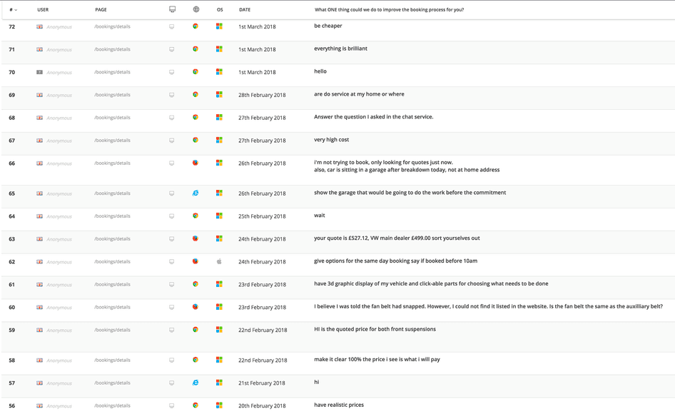
After adjusting prices based on this feedback, ClickMechanic saw their revenue grow by 60% in two months. Allowing customers to see who the mechanic was prior to booking increased conversions by 10%.
5. Personalize the browsing and buying experience
Some of your website visitors have concerns about buying from you. Do you ship to their country? How much does that shipping cost? Will it be hard to choose the right type, size, or color of your product?
Your potential customers need to feel seen, heard, and understood without having to reach out to your support team, because chances are, they’ve been burned before by other brands (read: spent an hour filling a cart, only to learn the brand doesn’t ship to their country).
How to implement this strategy
Here are a few ways to tailor touchpoints across your website to your ideal customer:
Show recommended products based on their answers to a short quiz
Display complementary products based on items currently in your shopper’s cart
Show the average shipping time based on your visitor’s location
Offer a unique discount code based on the customer’s loyalty status
The personalization tactic you choose comes down to what matters to your visitors, and you can use qualitative and quantitative data to learn what that is.
For example, website analytics will tell you which product pages visitors stay on the longest (quantitative), while open-ended survey responses from those pages will tell you why and what’s missing (qualitative).
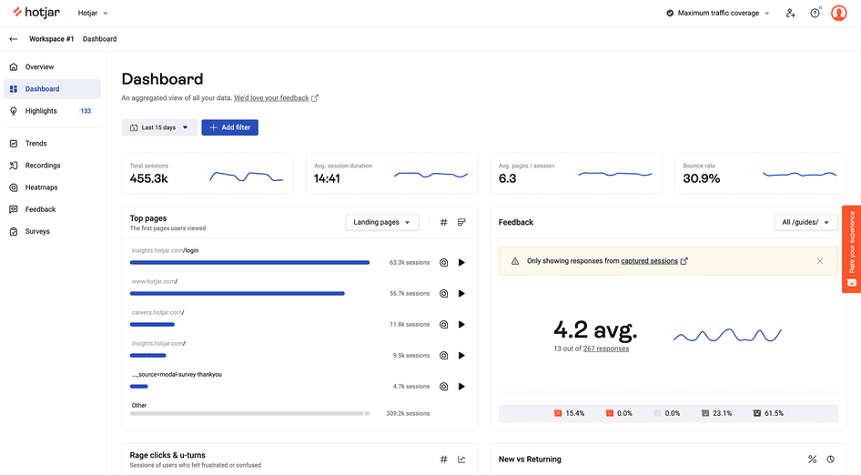
The Hotjar Dashboard gives you an overview of website analytics, like top pages, and user behavior, so you know which pages to personalize
A personalization example to get you inspired
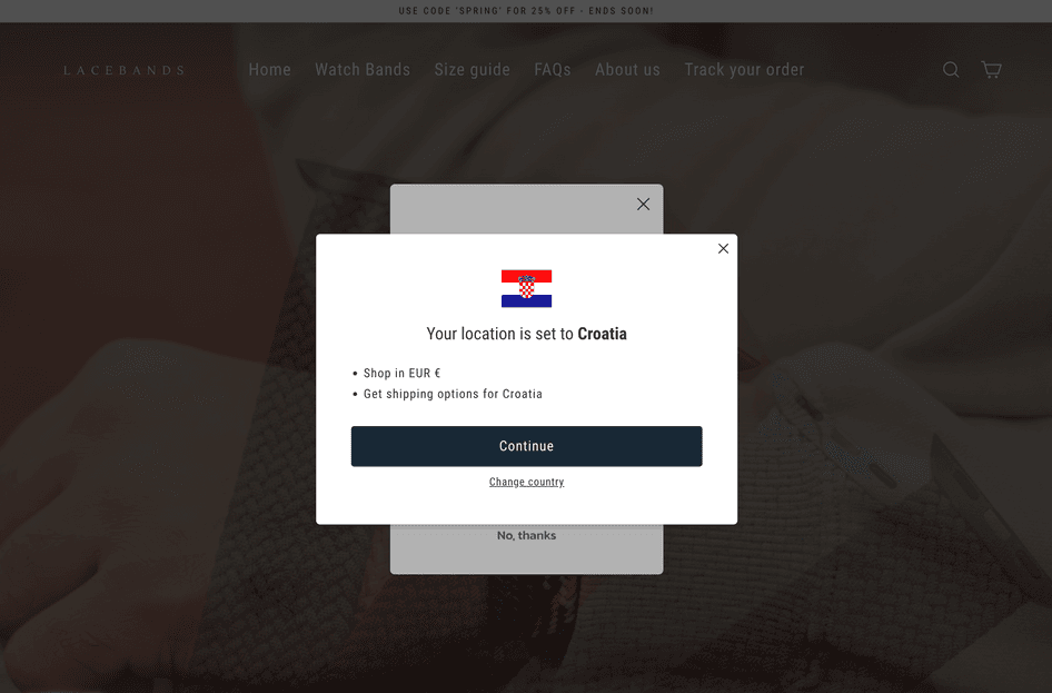
If you’re present in different countries and regions—which inherently complicates things like availability, shipping, and taxes—try doing what Lacebands does. This brand of smart watch bands shows a pop-up with the visitor’s location, along with a confirmation of their currency and country-specific shipping options:
6. Minimize the risk of making a purchase
Online shopping is essentially buying things you’ve never seen. Even one story about a neighbor or a relative who purchased a product online and got something subpar can be enough to make you hesitant about it.
Online shopping can feel risky, and sparks questions like:
Will I like the product?
What if it arrives damaged?
What if it doesn’t suit me?
What if I change my mind?
It’s up to you to minimize or erase user hesitation with options like easy returns, a money-back guarantee, free product samples, social proof like testimonials and product reviews from existing customers, or a free product demo—ideally a combination of these.
How to implement this strategy
Implementing almost any of the options above needs to be a company-wide decision, with buy-in from different departments. That’s because processes like returns and money-back guarantees affect everyone, from the support team to your ecommerce operations, as well as the overall company cash flow.
The best way to make that case is to use behavior insights and website feedback from visitors when speaking to stakeholders, like:
Survey responses to the “What’s stopping you from making a purchase?” question on your product or checkout page
Scores and qualitative feedback you’ve collected through a feedback widget on your website
Customer support conversations that ask about returns before making a purchase, and session recordings from those visitors
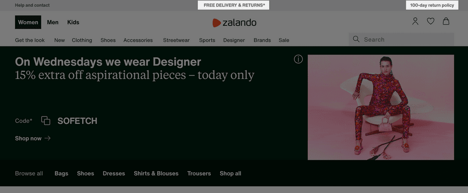
A risk-free shopping example to get you inspired
Zalando, an online fashion store, offers not only free shipping, but free returns within 100 days. Zalando’s visitors can see this at different points of their journey, including on the homepage and product pages:
7. Emphasize genuine scarcity
Scarcity happens when a product or an offer has limited availability. It encourages users to take action before the offer expires or a product goes out of stock.
The key is to only emphasize scarcity when it genuinely exists. If you fake an expiring discount or a ‘limited edition’ label only to reinstate it a few days later, you might temporarily drive sales—but you’ll show a lack of integrity and damage your customer’s trust in the long run.
How to implement this strategy
Because it induces FOMO—the fear of missing out—scarcity is a powerful technique. First, identify a couple of ways that scarcity genuinely exists in your business. It could be:
A discount code expiring soon
Low stock levels of a product
Limited edition items or products you’ll discontinue soon
An option to get a gift with an order
Then, use elements like countdown timers, subtle labels, compelling copy on your website and product pages, and last-chance emails to nudge your audience to take action.
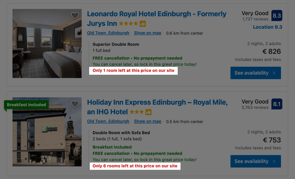
A scarcity example to get you inspired
The travel industry might be the leader in implementing scarcity—hotels, airlines, and travel booking companies all know how to get visitors to take action.
Once rooms and airplane seats are gone, they’re gone, and Booking.com does this well on its search results page:
8. Analyze your sales funnel to find where users drop off
Your macro-conversion rate—the portion of visitors you turn into customers—is made of many micro-conversions in your sales funnel. Think of a user clicking a product link from your homepage, adding that product to the cart, and viewing the cart page to start the checkout process.
By increasing each of those micro-conversion rates, you’ll increase your overall conversion rate and grow your sales and revenue.
How to implement this strategy
Start your funnel analysis with a website analytics tool like Google Analytics (or the Hotjar Dashboard) that shows you quantitative data like time on page, bounce rates, and exit rates for key pages in the customer journey, giving you the big picture of your conversion funnel.
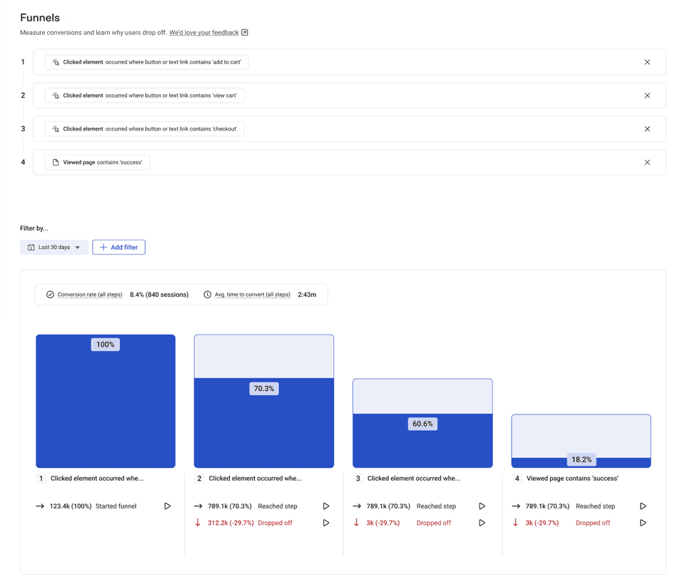
Then, dive deeper into what’s happening at each step. Here’s how Hotjar makes that easy:
Funnels give you a full overview of your funnel and show you which pages or steps users drop off the most
Recordings show you the exact behavior that led to the drop-off
Filters let you view specific journeys based on conditions like pages viewed, elements clicked, session duration, or location
Sales funnel analysis example to get you inspired
Gogoprint, an online printing service provider, wanted to improve their user experience and understand why visitors were dropping off their website.
Piriya Kantong, Gogoprint’s Senior Online Marketing Analyst, leaned on insights from Hotjar and found that the pricing page had a design issue that confused visitors and caused many of them to leave.
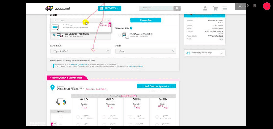
After testing a few layout options, Gogoprint’s drop-off rate on this step decreased by 7%, and conversions increased by 2%.
9. Make the online shopping experience reflect real life
When you’re shopping in person, you get to see and touch the products you’re browsing. An ecommerce site limits you to a few paragraphs of product descriptions and some visuals, often asking your imagination to do the hard work to help you visualize what the product looks or feels like in real life.
It sounds basic, but it’s a powerful way to increase your conversion rate: include high-quality images of the product in use, videos from all angles, and size comparison tools on your product pages.
How to implement this strategy
The key is to uncover customers’ questions and struggles that are specific to the fact they can’t see or feel the product in person.
Look for those questions in interactions between your customers and your company, from resources like:
Website chat conversations
Support call transcripts
Social media interactions
Website survey responses
You can also look at reviews and questions for similar products on Amazon—if there are frequent questions about sizing (“Will this fit into a 60cm cupboard?”), it’s a good sign that photos and videos of real-life use would help.
Start with your most popular products and develop new videos, images, or charts to help visitors visualize themselves using them.
A life-like shopping example to get you inspired
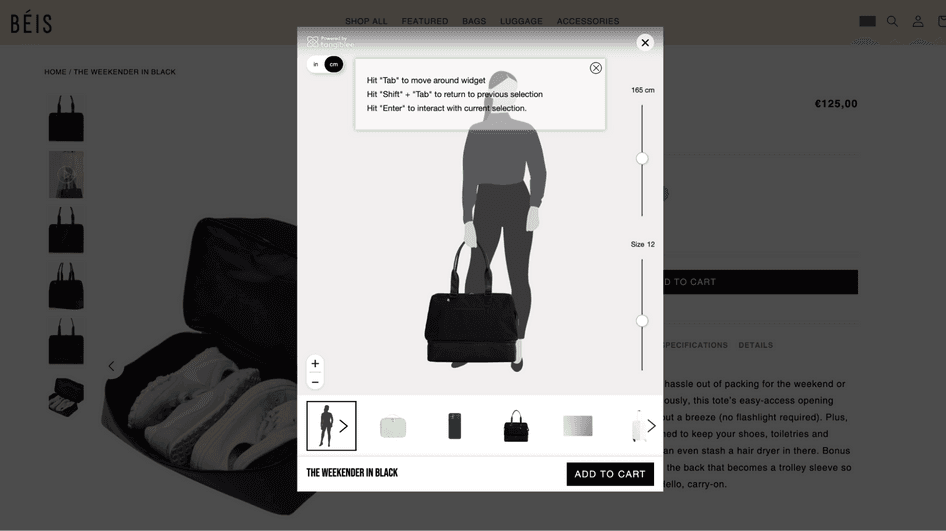
Béis, a company selling travel essentials like luggage and backpacks, gives users the option to ‘View product size’ on its product pages. Once visitors click that, they can compare the size of the bag to their height and other common products like a smartphone or a laptop.
No more having to whip up a measuring tape to figure out product sizes:
Hit your conversion goals by fulfilling users’ needs
Nine strategies is a lot of strategies. You don’t need to use all of these to drive your conversion rate up and generate meaningful results.
Start with just one or two to better understand how your users experience your site, what they want from it, and what’s missing. Then, use what you’ve learned to implement website changes and monitor the outcomes. This will tell you how successful that strategy has been for you, so you can learn from it and keep improving in the long run.
Remember two things: understanding what keeps your visitors from converting is essential, and increasing conversions is an ongoing process. Lead your efforts with this mindset and you’re bound to succeed.
Uncover the mystery of low conversion rates
Hotjar shows you what keeps your visitors from buying. Make website changes based on real insights, not assumptions, and watch your conversion rate grow.
FAQs about increasing conversions
Related articles

CRO
7 stats that prove user-centric websites win for mid-market companies in 2024 (with tips on how to improve UX)
Is your website user experience holding you back? Don’t rely on guesswork and gut feeling alone: use data to elevate your UX and enhance your bottom line.

Shadz Loresco
CRO
7 stats that prove user-centric websites win in 2024 (with tips on how to improve UX)
Is your website user experience holding you back? Don’t rely on guesswork and gut feeling alone: use data to elevate your UX and enhance your bottom line.
Shadz Loresco

CRO
How to improve your online reputation to acquire more users and customers
A good online reputation inspires your users to share positive reviews that make your business more trustworthy in the eyes of potential customers, and, in turn, increases sales.
But it takes more than a good product to build and maintain an effective online presence. You have to actively listen to customers to understand how they feel and make changes to improve the user experience (UX).
Hotjar team